A code-friendly tutorial about exploratory data analysis (EDA) using my household energy usage. The article explores plots and technical topics such as stationarity.
Outcomes:
the log transformation is useful
differencing d = 365 helps remove the annual seasonality in the data
About
This article is part of a larger series. The primary component underpinning the rest is a data engineering pipeline that preps the data for analysis. The culmination of this work is a forecasting API hosted on my household server. The insights from this EDA will guide the forecasting workflow.
Finally, a note about code. As a multilingual programmer (Python, R, and Julia), I will display Python and R output. For brevity, I’ve chosen not to show the code itself. However, the code base is publicly available here.
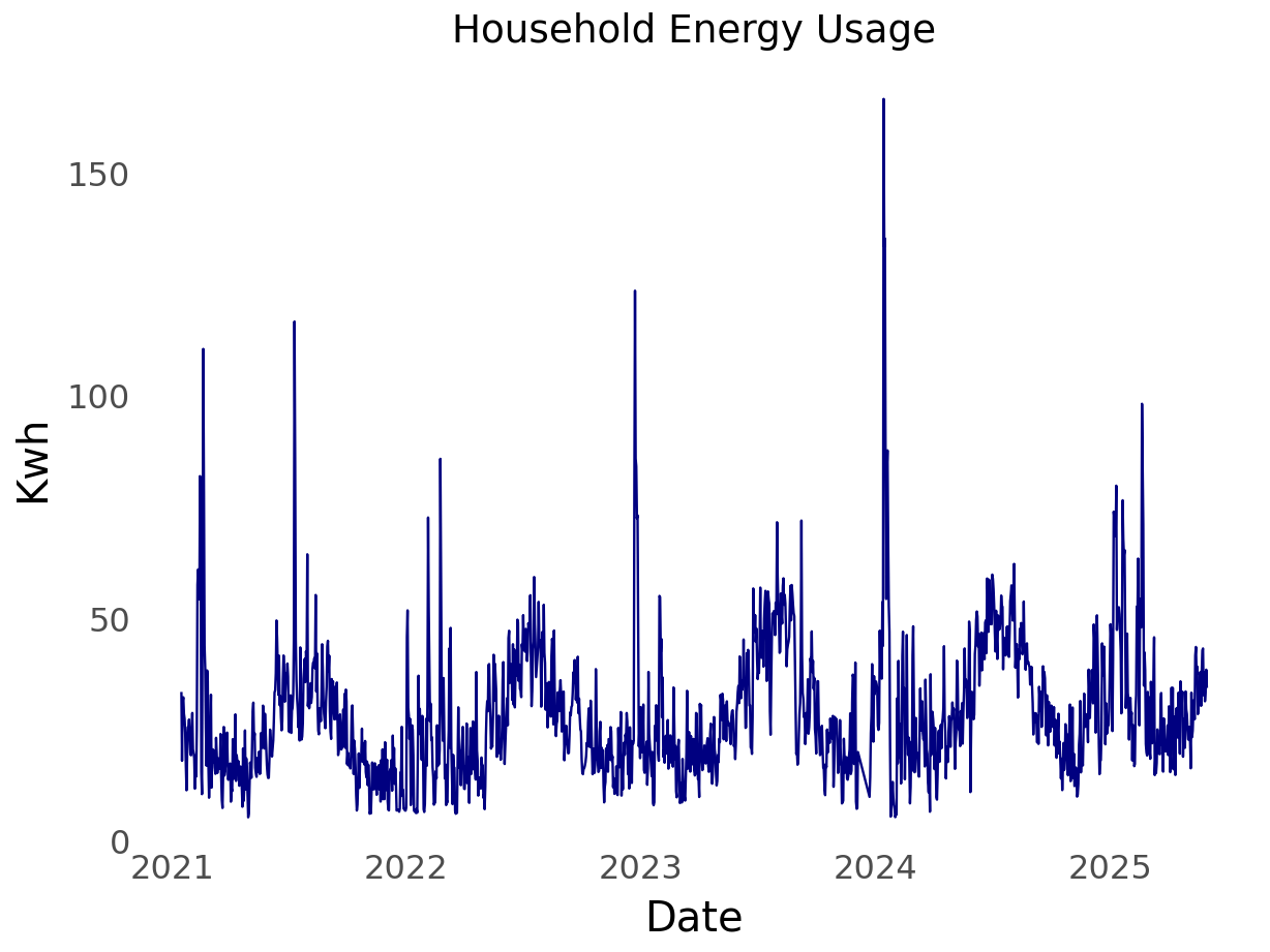
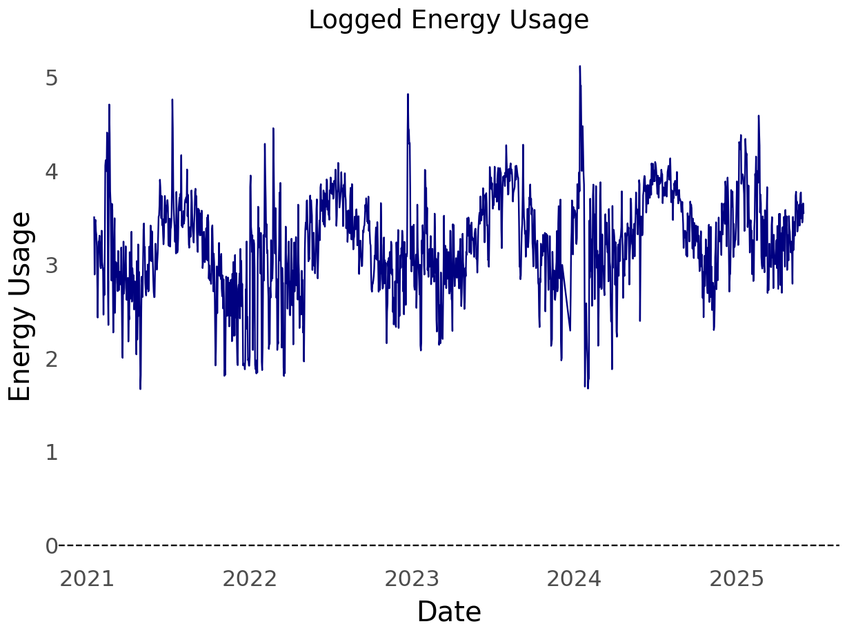
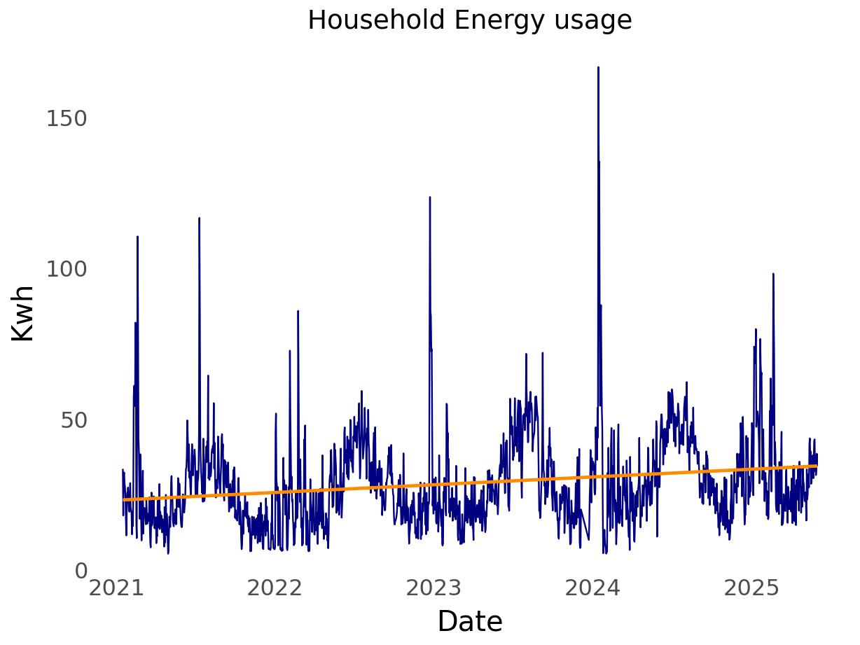
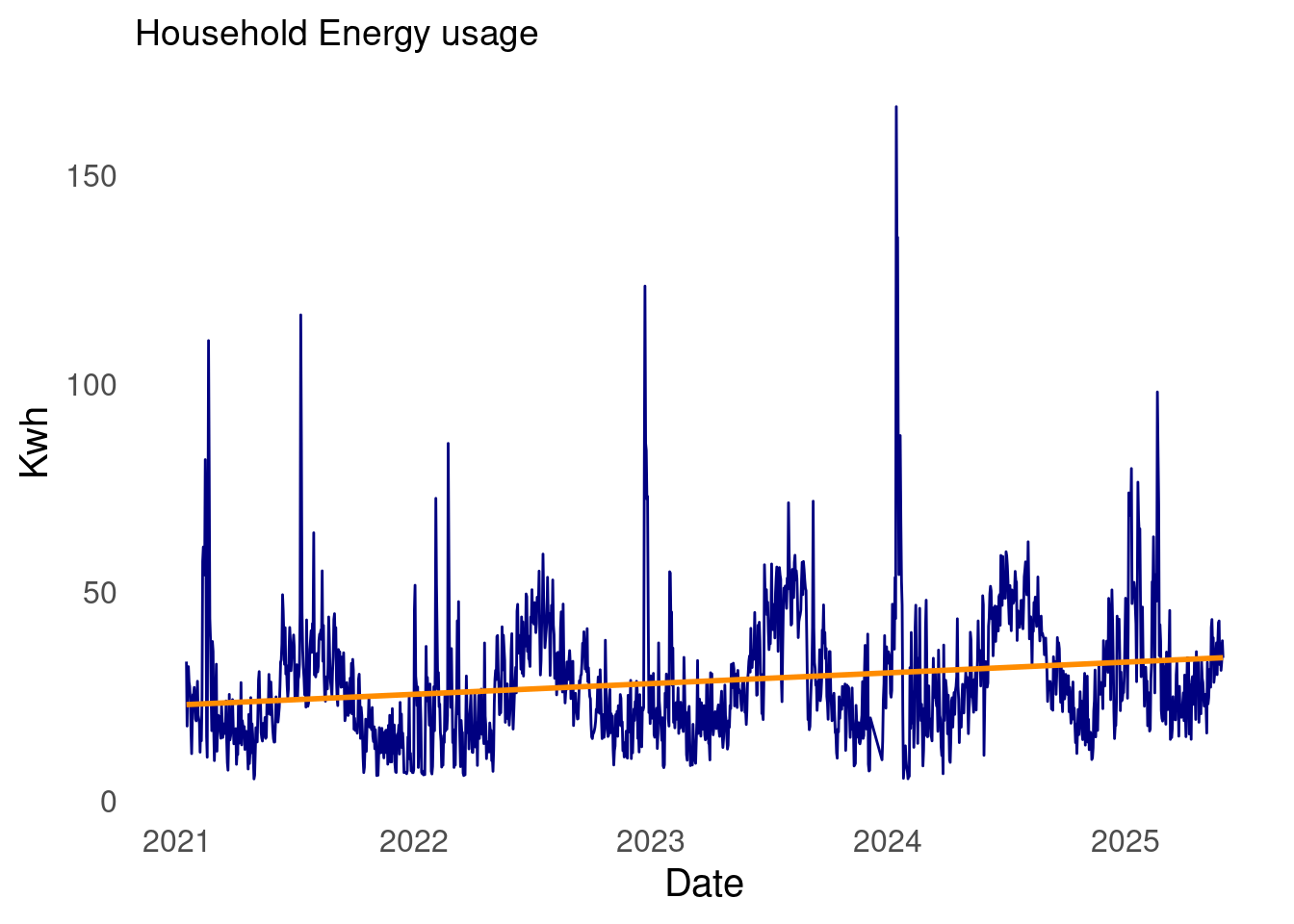
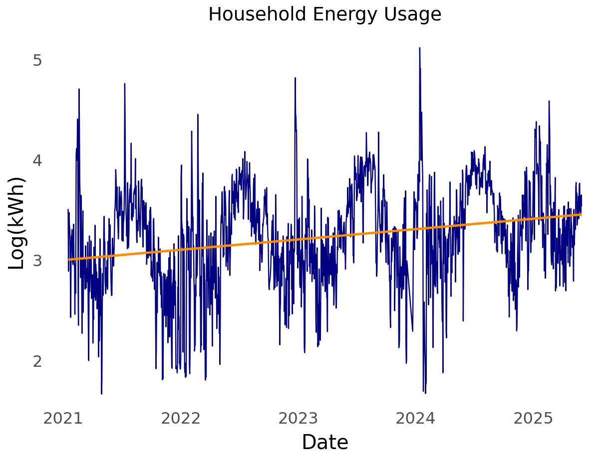
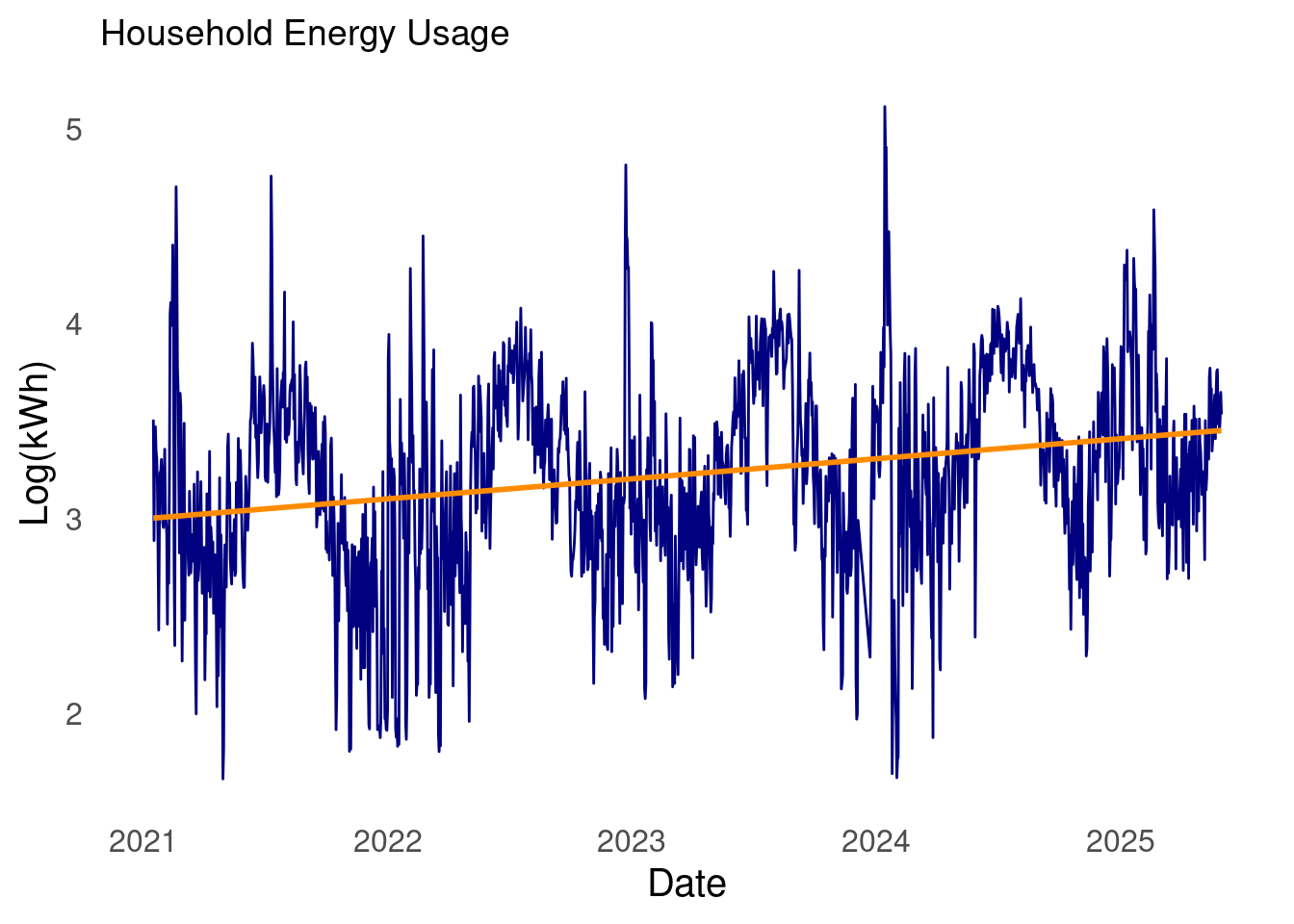
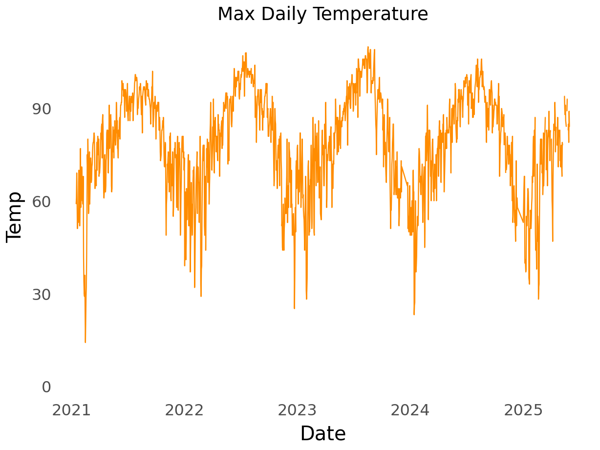
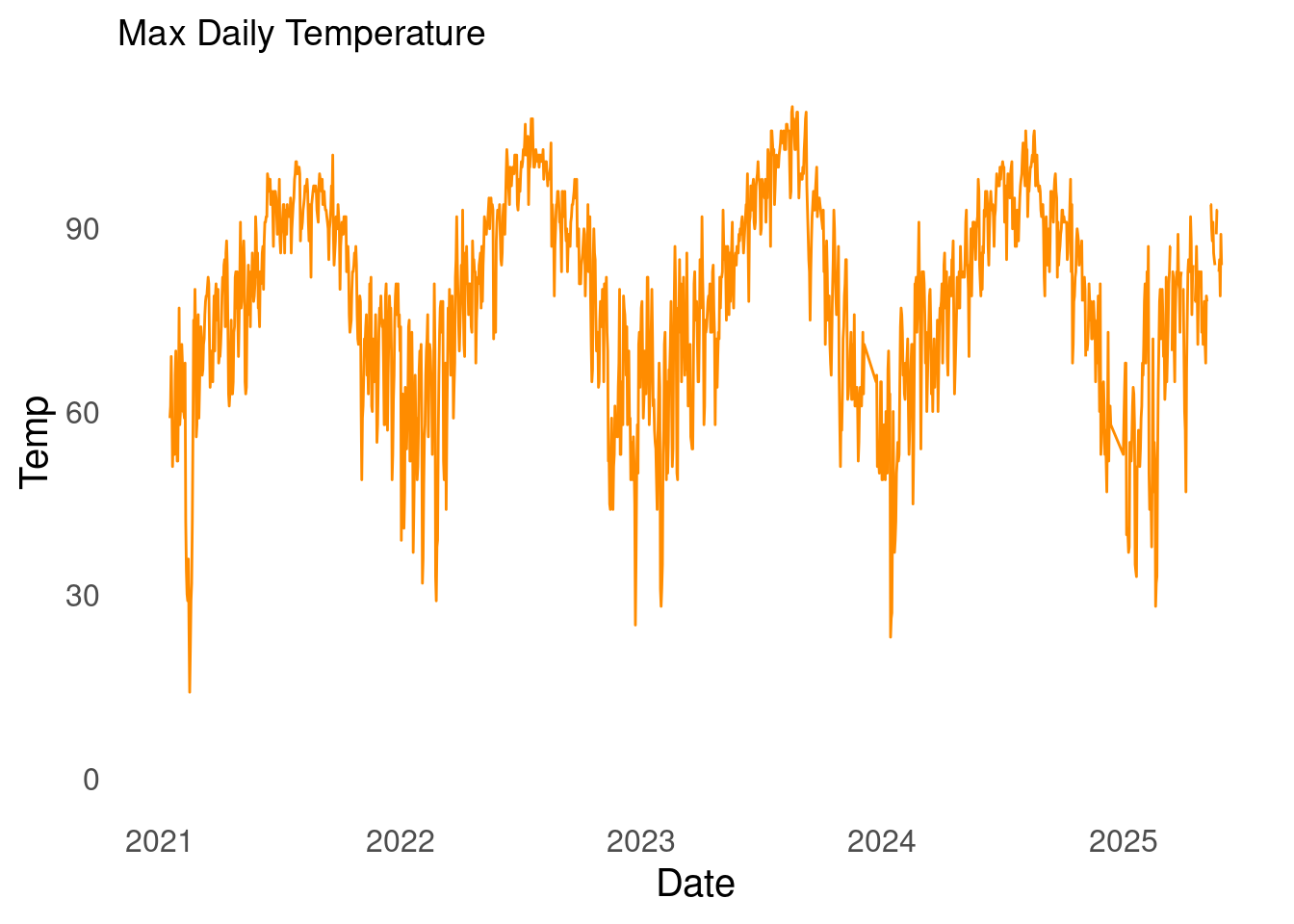
My household energy usage
Without further ado. I present my household energy usage data.
The start date of the time series is 2021-01-16 and the latest date is 2025-05-31, and there are 1,572 days in the series.
To create the plots I used the ggplot2 package in R and the plotnine package in Python. Why plotnine? For a few reasons. First, it’s a replica of ggplot, which means I don’t have to learn new syntax. Second, I can without many adjustments copy and paste the R code. Efficiency is important. As is avoiding repetition - I learned the DRY principle from The Pragmatic Programmer(Hunt and Thomas 1999).
Let me show you what I mean. Below are the import statements for ggplot and plotnine.
See? They’re the same/ similar. The only difference is that the R code is imported via the box package. What is box? That is a conversation for a different time. Suffice to say that box is a modern way of importing packages and namespaces in R. Using box makes transitioning between languages breezy.
I am performing EDA on my household energy data because I want to create a forecast. Before jumping into forecasting work though a better understanding of the data is needed. This is especially true when working with statistical models.
In the time series class in grad school we used Time Series, A Data Analysis Approach Using R(Robert H. Shumway 2019). I’ll use this book as the guide for performing EDA. It’s worth noting that there are many great resources for time series, such as anything by Rob Hyndman.
Our focus is to assess what transformations are needed to achieve stationarity.
definition of stationarity
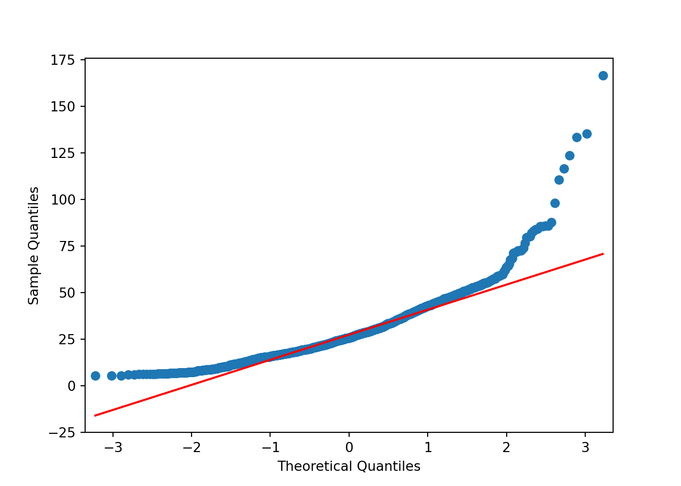
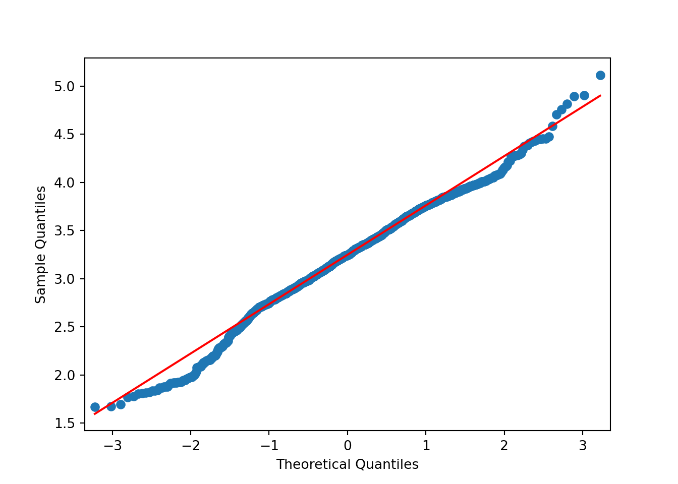
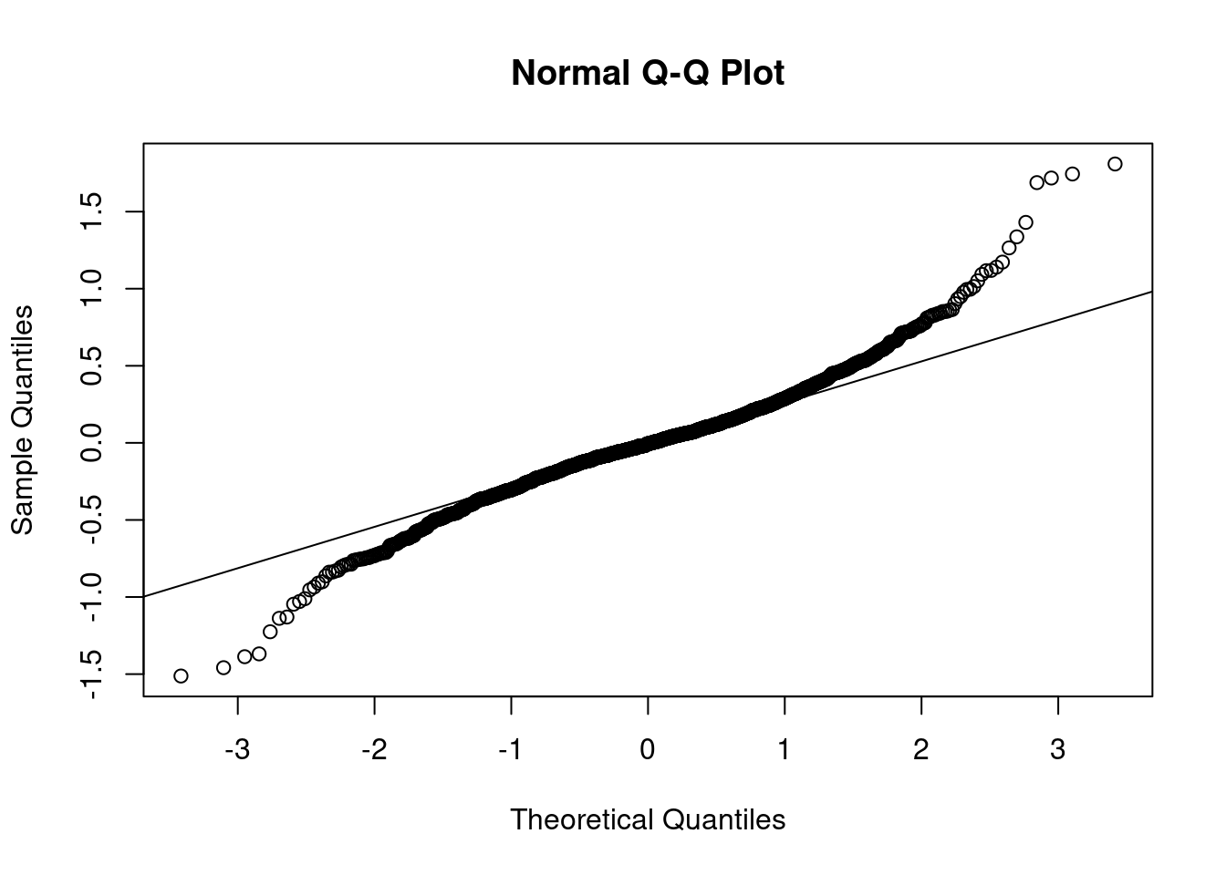
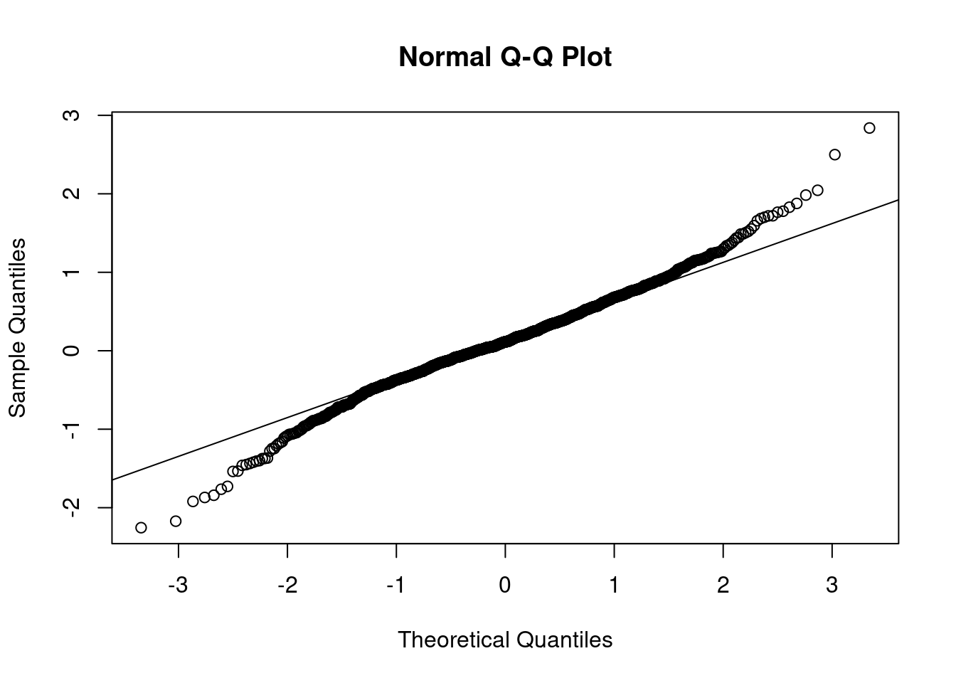
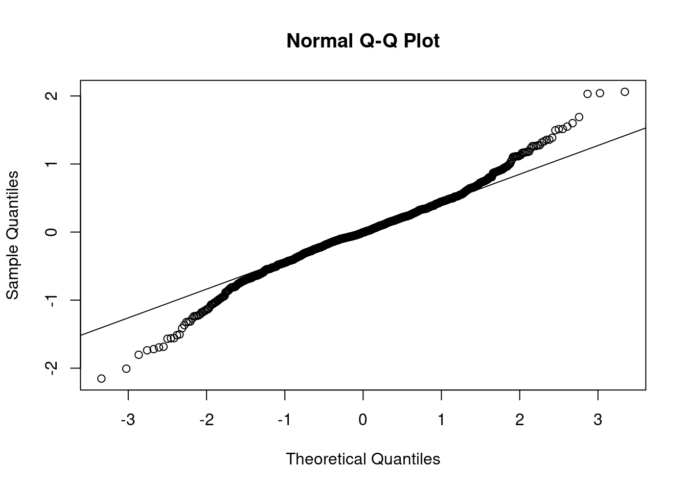
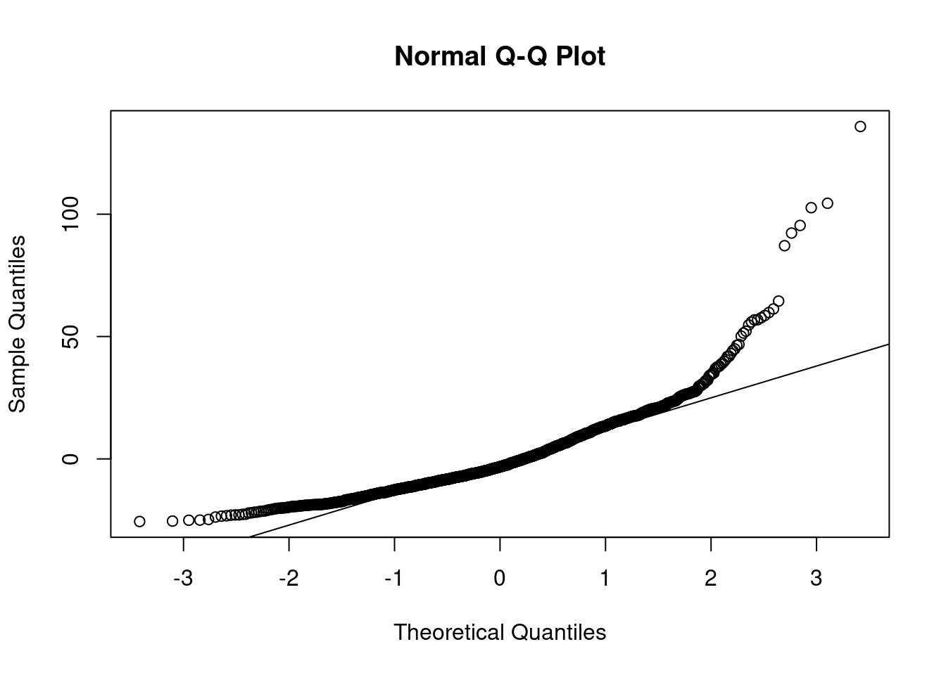
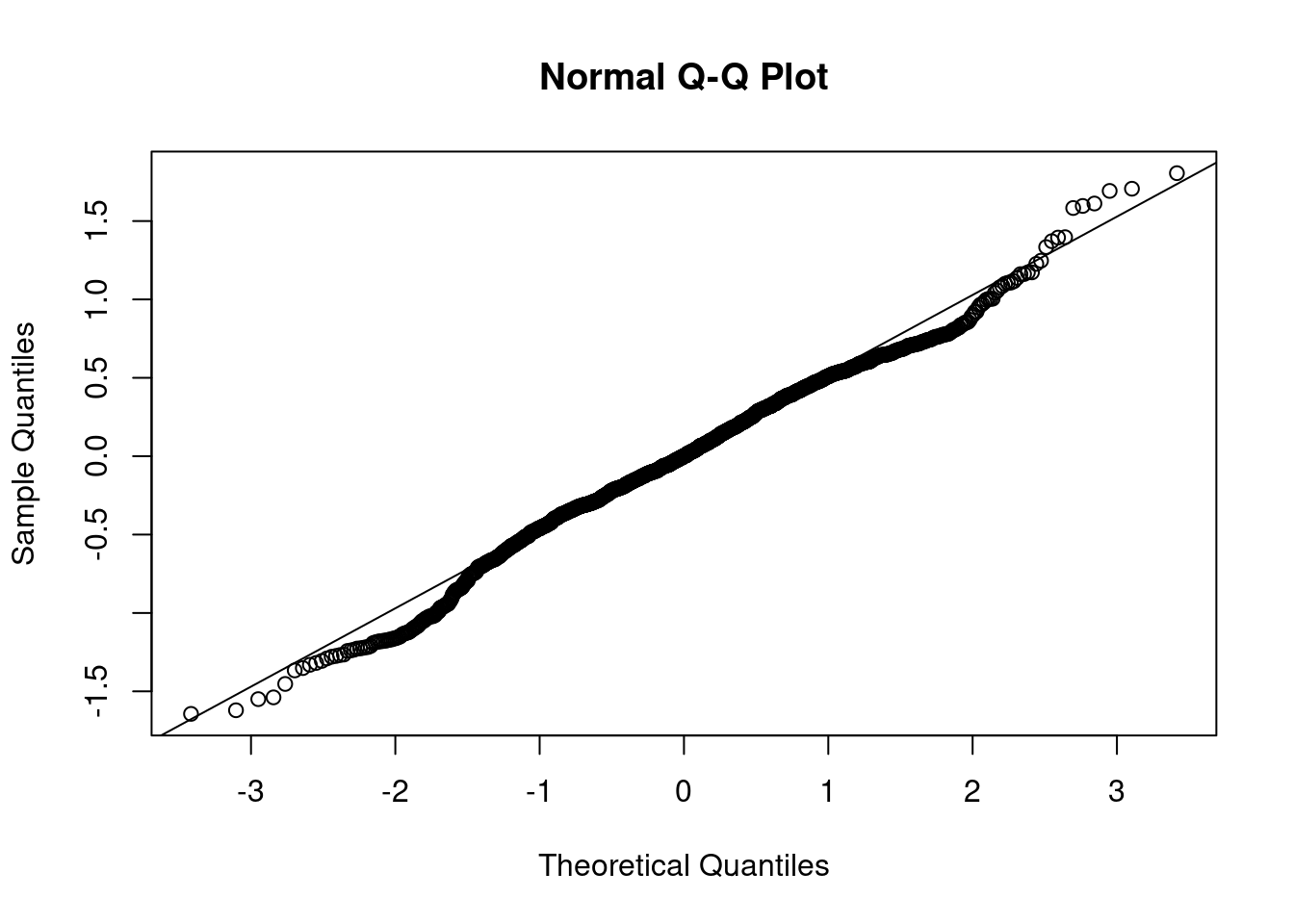
Stationarity is particularly important for statistical models. In the following sections we’ll perform a procedure and assess if the data is stationary via a QQ-plot. I find plots more useful than using a hypothesis test.
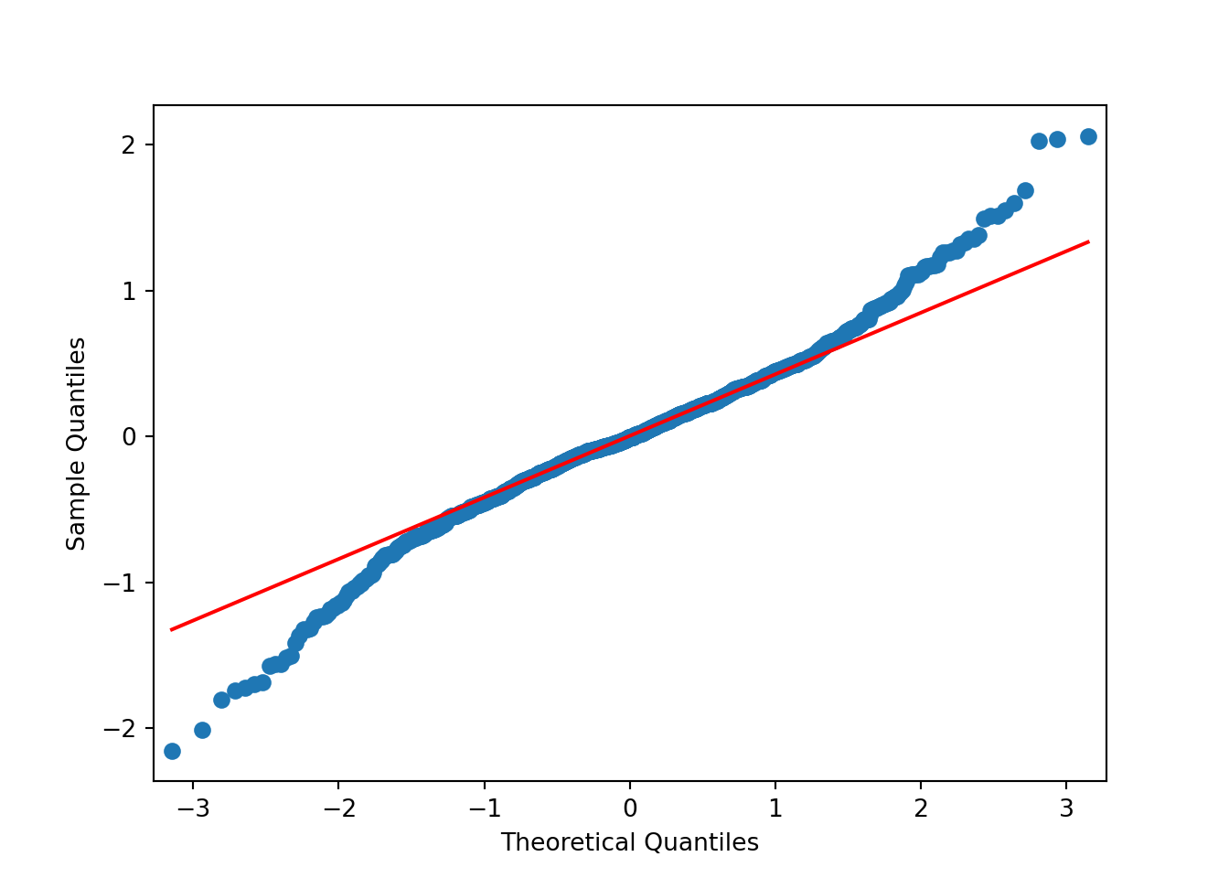
Based on the above plots there’s no need to formally test anything. It’s obvious the data isn’t normally distributed. The data has lighter tails than the \(N()\) on the right hand side and heavier tails than the \(N()\) on the left hand side.
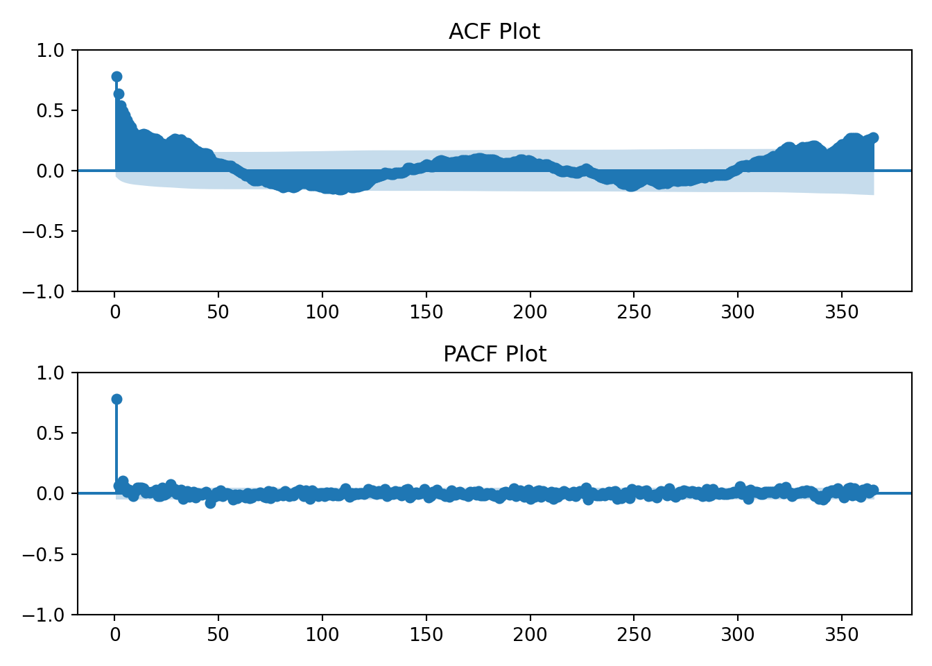
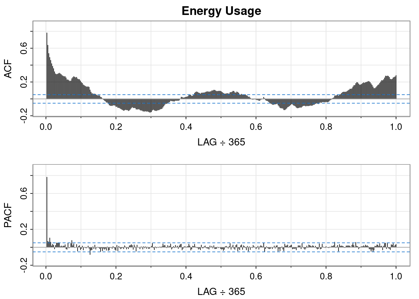
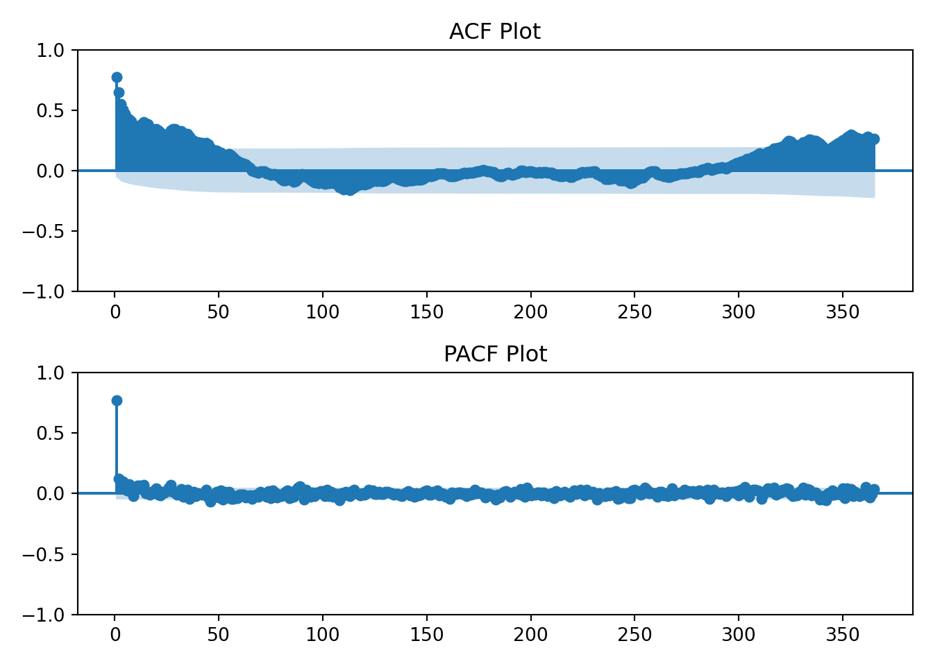
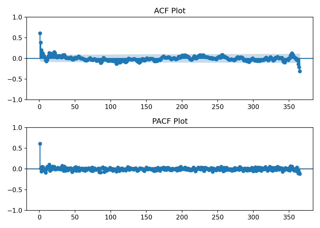
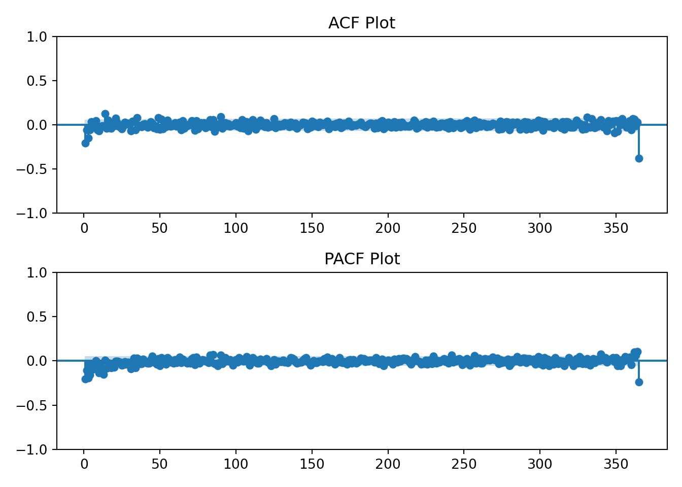
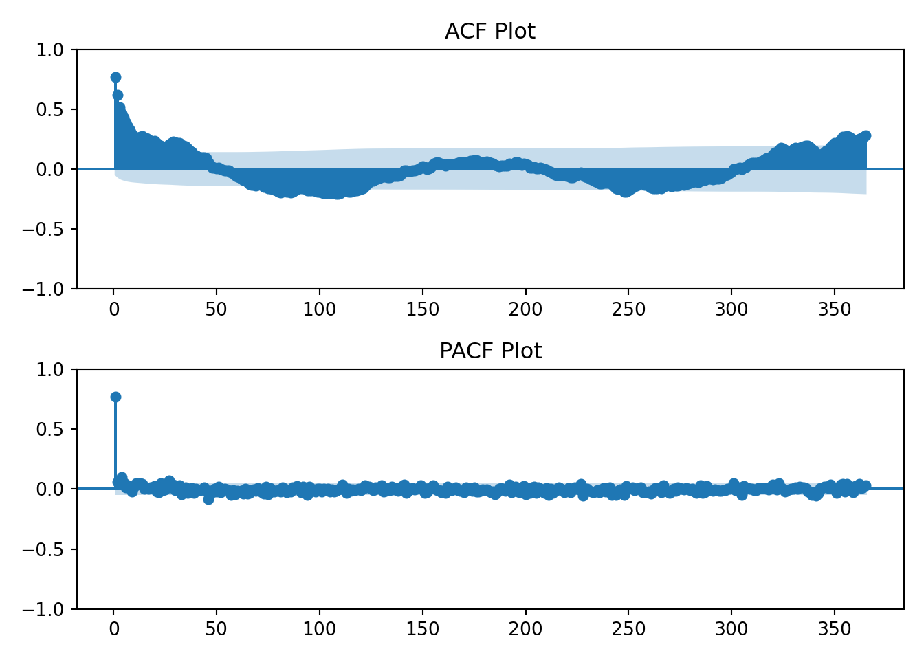
I’ll also now introduce the ACF and PACF plots. From Time Series(Robert H. Shumway 2019):
AR\((p)\)
MA\((q)\)
ARMA\((p, q)\)
ACF
Tails off
Cuts off after lag \(q\)
Tails off
PACF
Cuts off after lag \(p\)
Tails off
Tails off
Using the table above we’ll visually analyze the plots below of the raw data to determine if the data has an AR, MA, or ARMA specification.
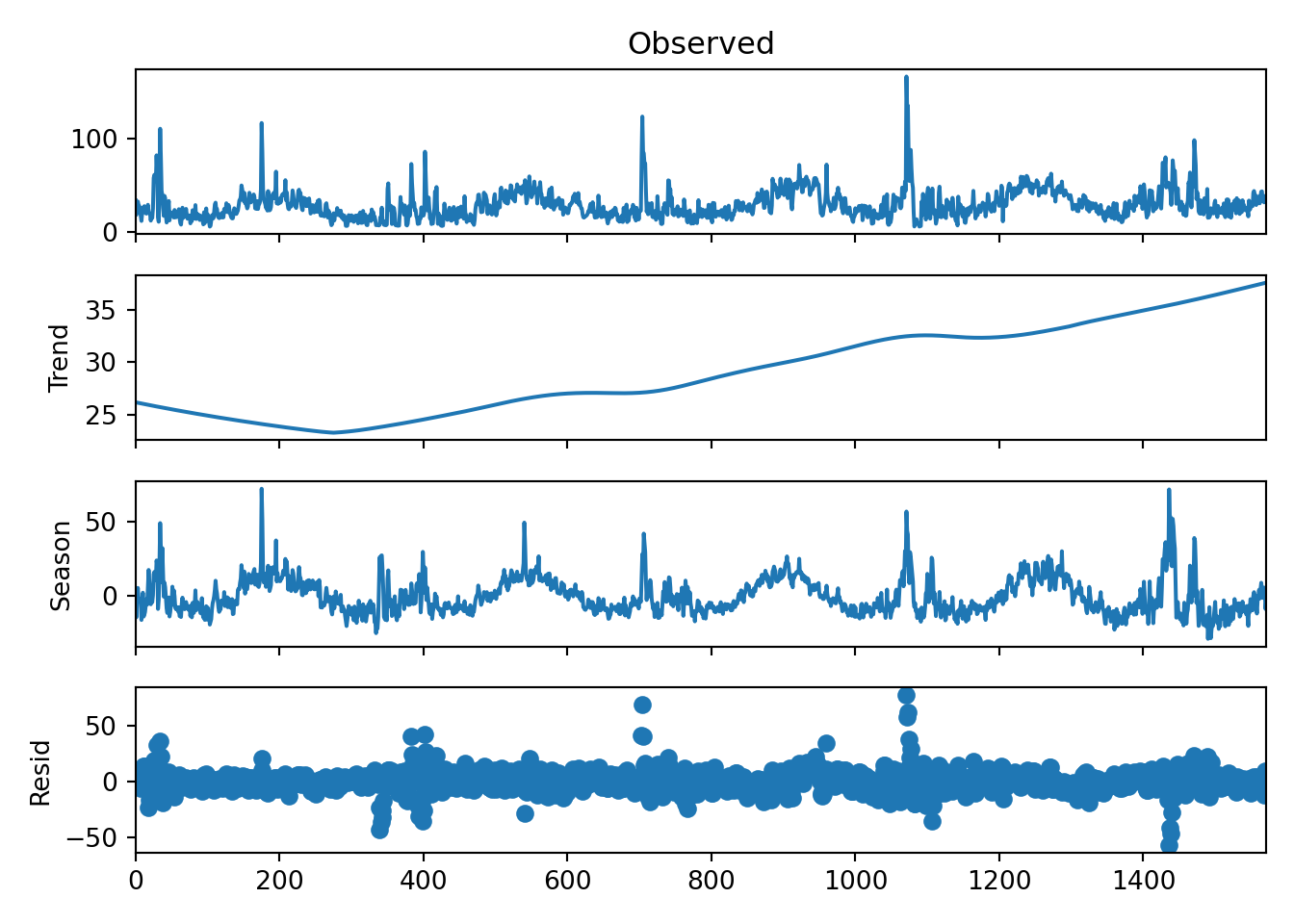
# STL decomposition with a periodic seasonal componentstl = STL( r.df_energy[['kwh']], seasonal=365, period =365)result = stl.fit()# Plotting the resultsresult.plot()plt.show()
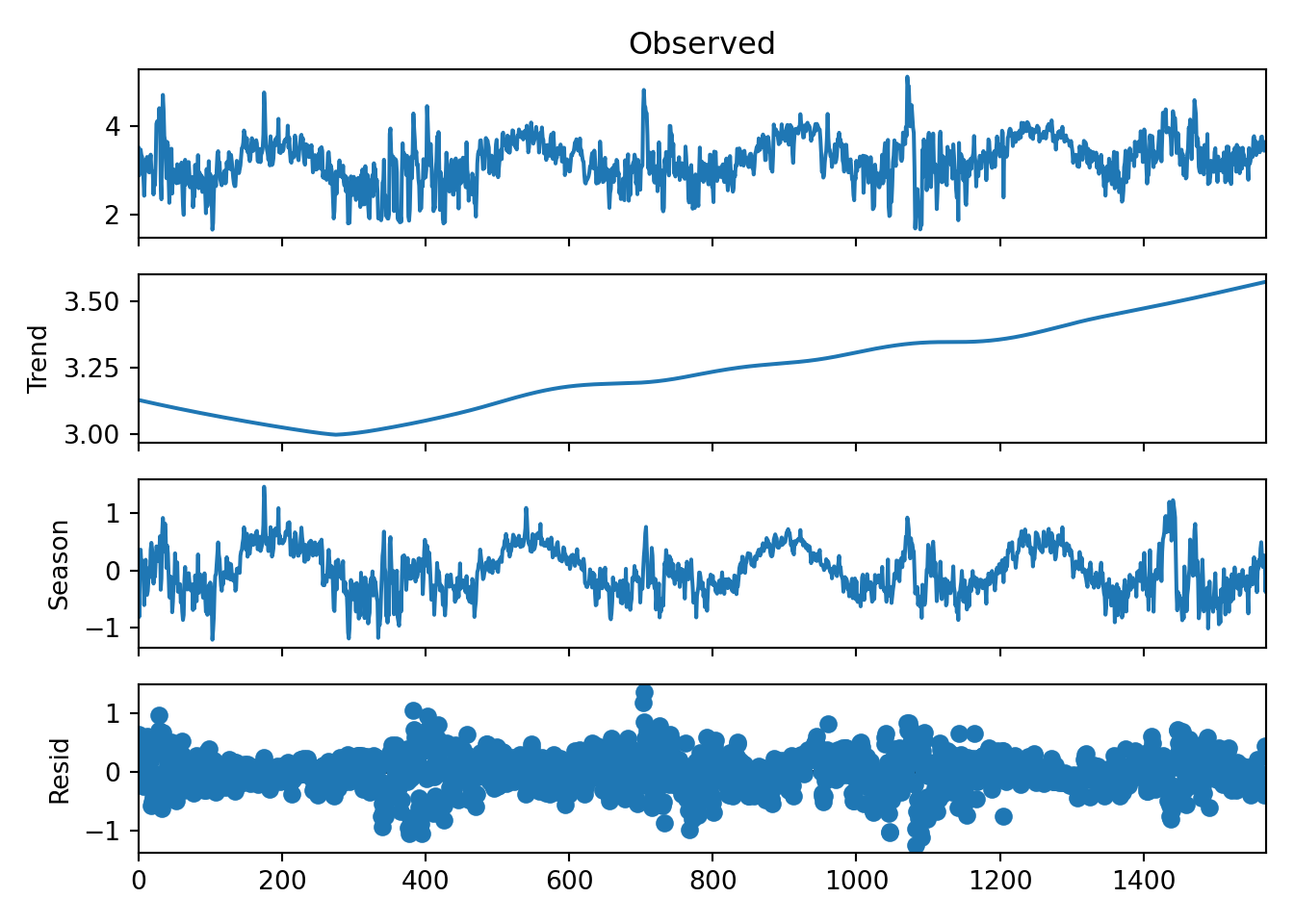
# STL decomposition with a periodic seasonal componentstl = STL( r.df_energy[['kwh_log']], seasonal=365, period =365)result = stl.fit()# Plotting the resultsresult.plot()plt.show()
Unhide
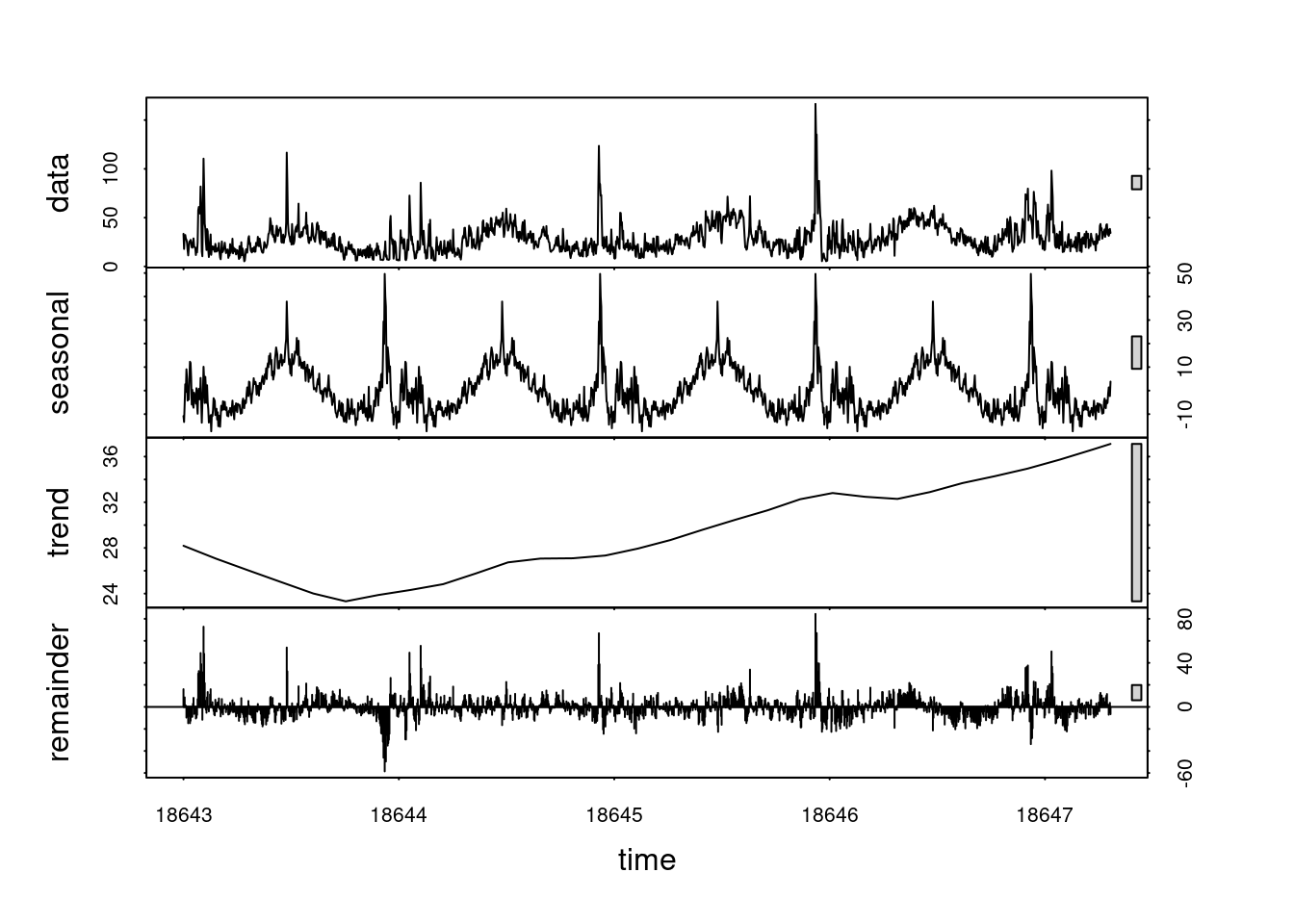
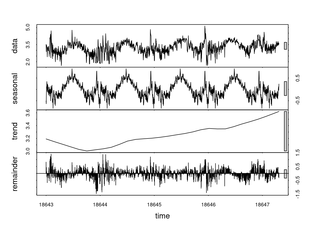
plot(stl(log(ts_data), s.window ="periodic"))
Transformations
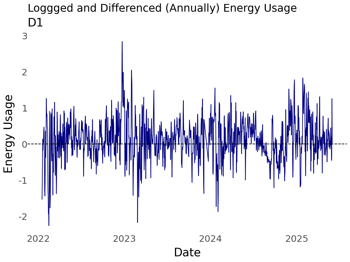
From school and experience, I’ve found that the log transformation is worth exploring. This is because the log flattens out perturbations. As can be seen in the plot of my household energy usage, there are quite a few large spikes over time.
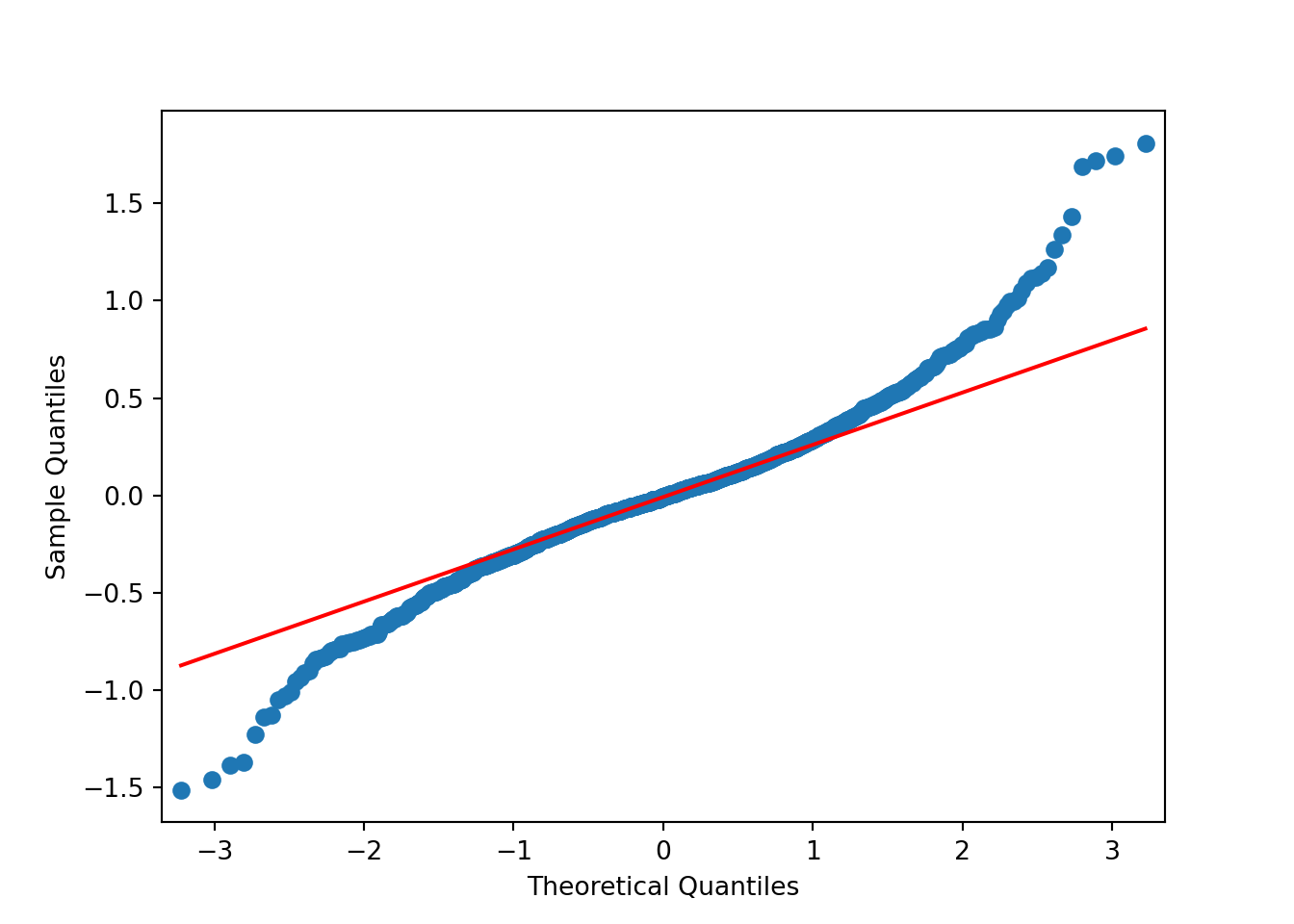
The results of applying the log transformation to the data looks good. The QQ-plot looks much better. There’s still some deviation around \(\pm 2\). Perhaps something else is needed. For now, though, the subsequent analyses will use the log-transformed data.
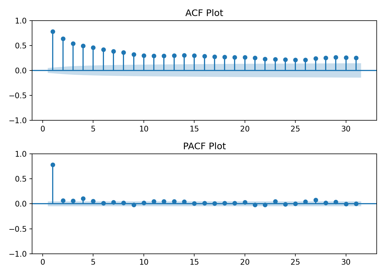
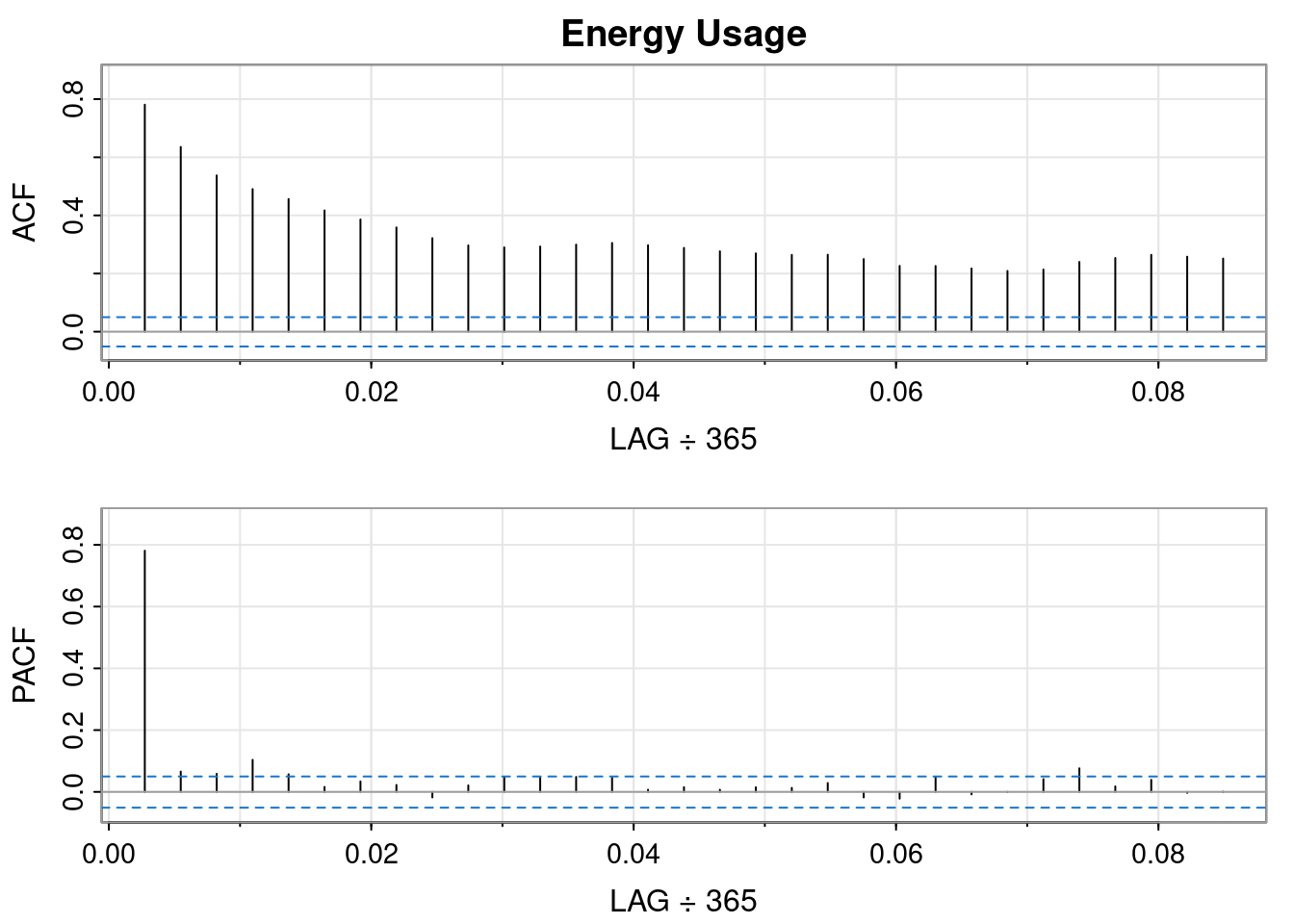
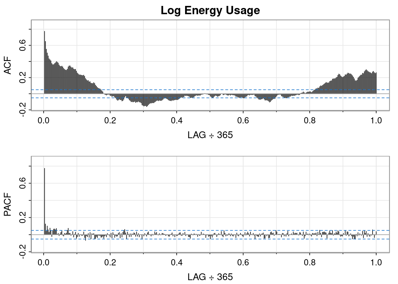
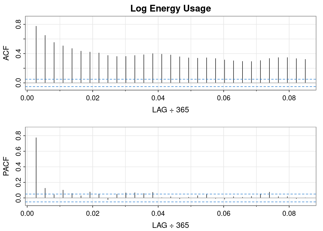
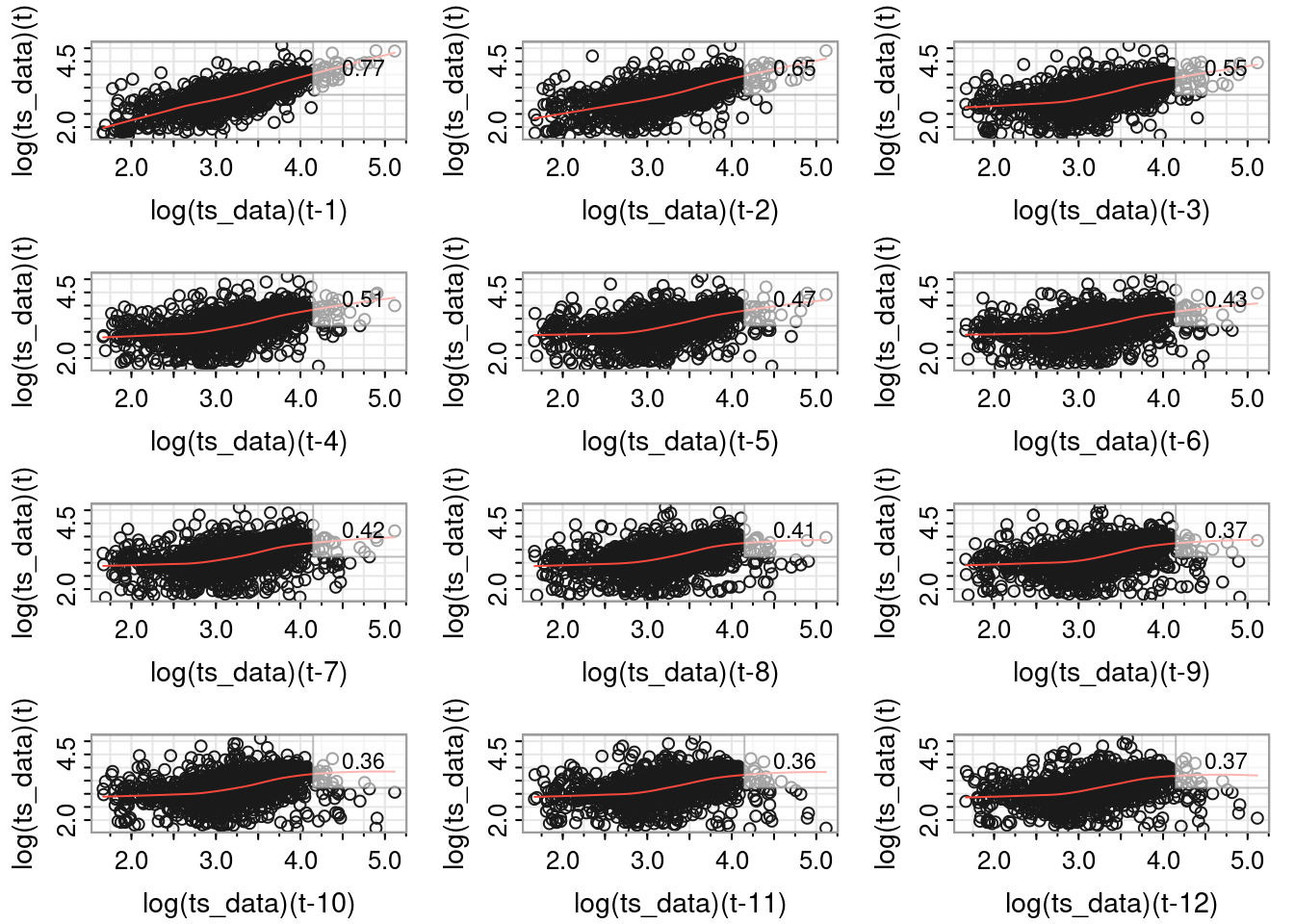
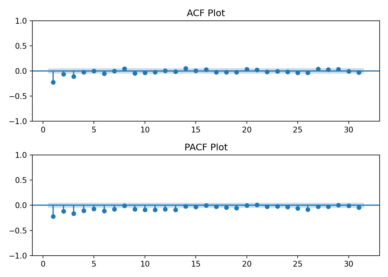
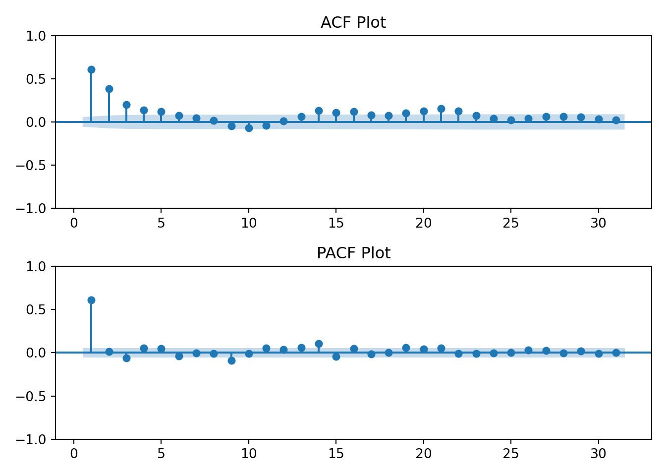
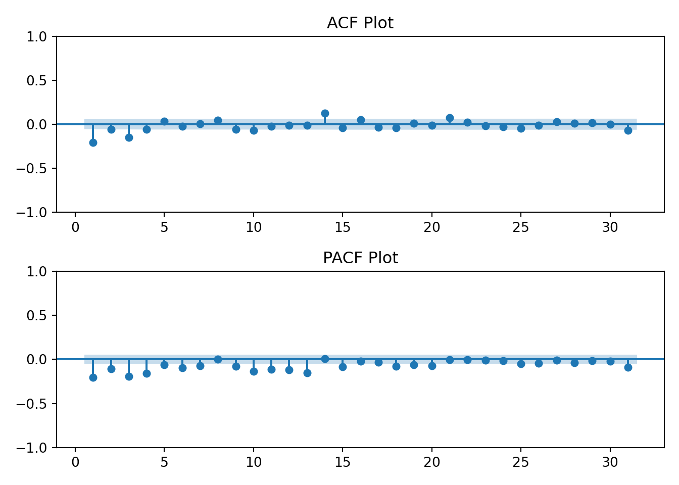
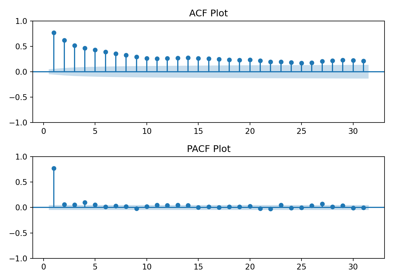
tmp <-acf2(log(ts_data), max.lag =31, main ="Log Energy Usage")
The log transformation hasn’t changed the earlier interpretation of the ACF and PACF plots. The data still resembles an AR(1) process.
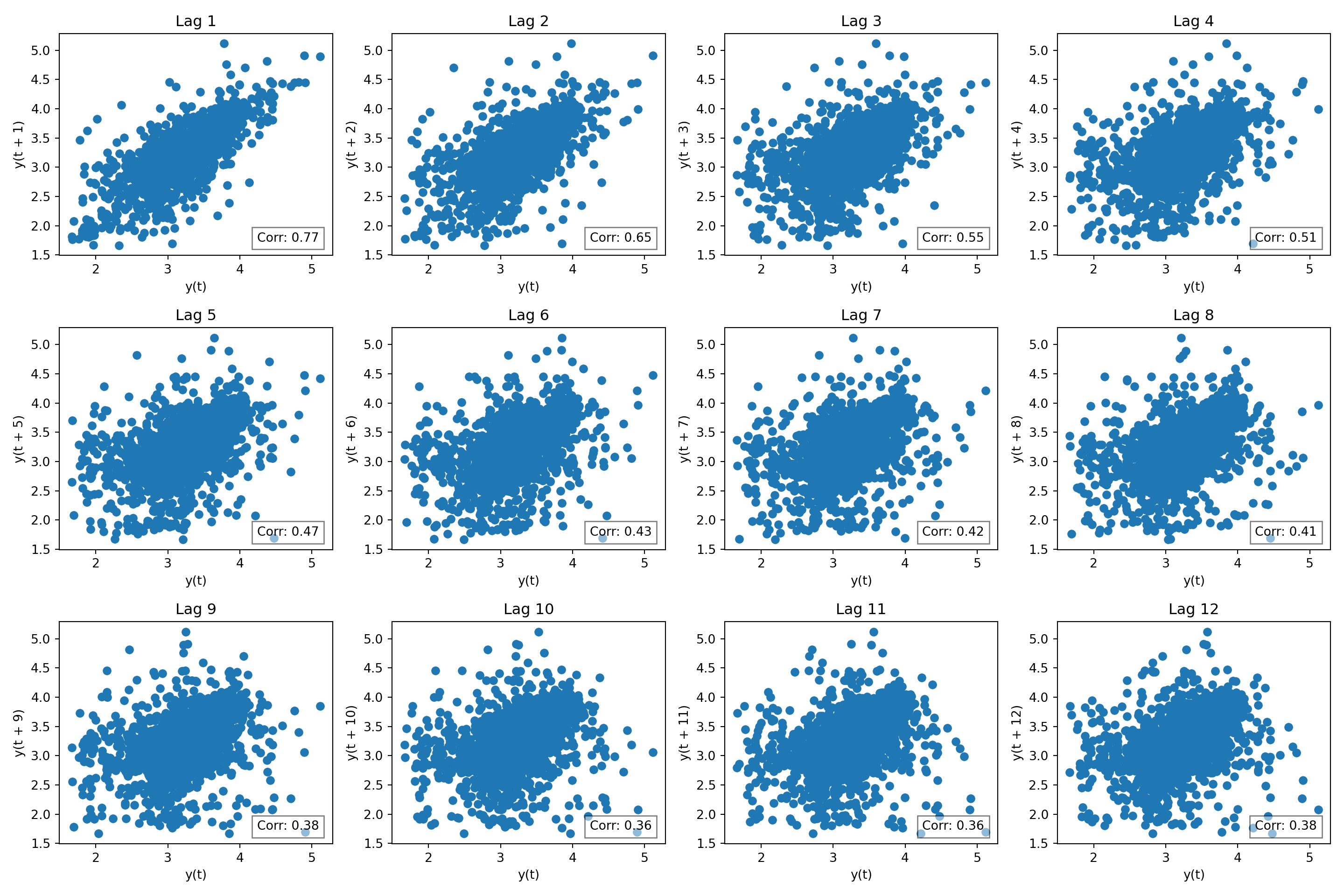
Lag plots
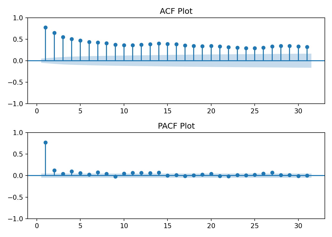
So the log transformation helped the data look more normal. Next, another common task in time series EDA, autocorrelation. There are specific methods to assess this, but first a visual building block: lag plots.
The period or frequency of the data is daily (i.e., 365). It would be too cumbersome to plot 365 lags. Instead for illustrative purposes, let’s keep the max lag \(\leq 12\). I chose 12 arbitrarily.
The data has a strong correlation (\(\rho \gt 0.5\)) through lag 4. Interpretation: at any given day, my household’s energy usage is related to the prior four days energy usage.
So, what? Serial correlation or auto correlation violates an assumption of linear regression. And since many stats models are regression based, that’s a problem.
Differencing
Differncing is a useful technique to address auto correlation.
It’s useful to think about the data before blindly doing things. This is especially true for differencing, there are risks to over-differencing.
Given what I know about the data and based on the first plot of the data, it seems useful to test for day-over-day correlations and annual seasonality. Any given day’s enery usage \(t_i\) is likely similar to that of the day before \(t_{i-1}\) - from the lag plot the correlation at lag 1 is \(\approx 0.8\). While the lag plot only displayed lags 1 through 12, common sense tells us that the weather or climate impacts energy usage. We know that summers tend to be similar. So, the climate in July 2024 is probably similar to the climate of prior years.
This is differencing notation \(\bigtriangledown^d\), \(d\) denotes the order.
When:
\(d\) = 1, removes a linear trend
\(d\) = 2, removes a quadtratic trend
…
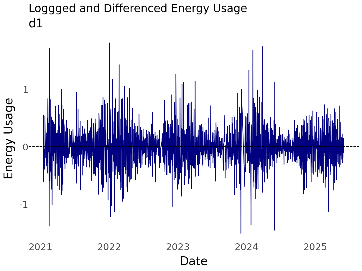
It’s possible to chain operations. For example, first log transform the data then difference. Transformations were discussed earlier because they are often applied before differencing.
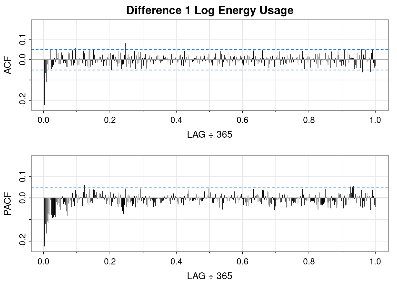
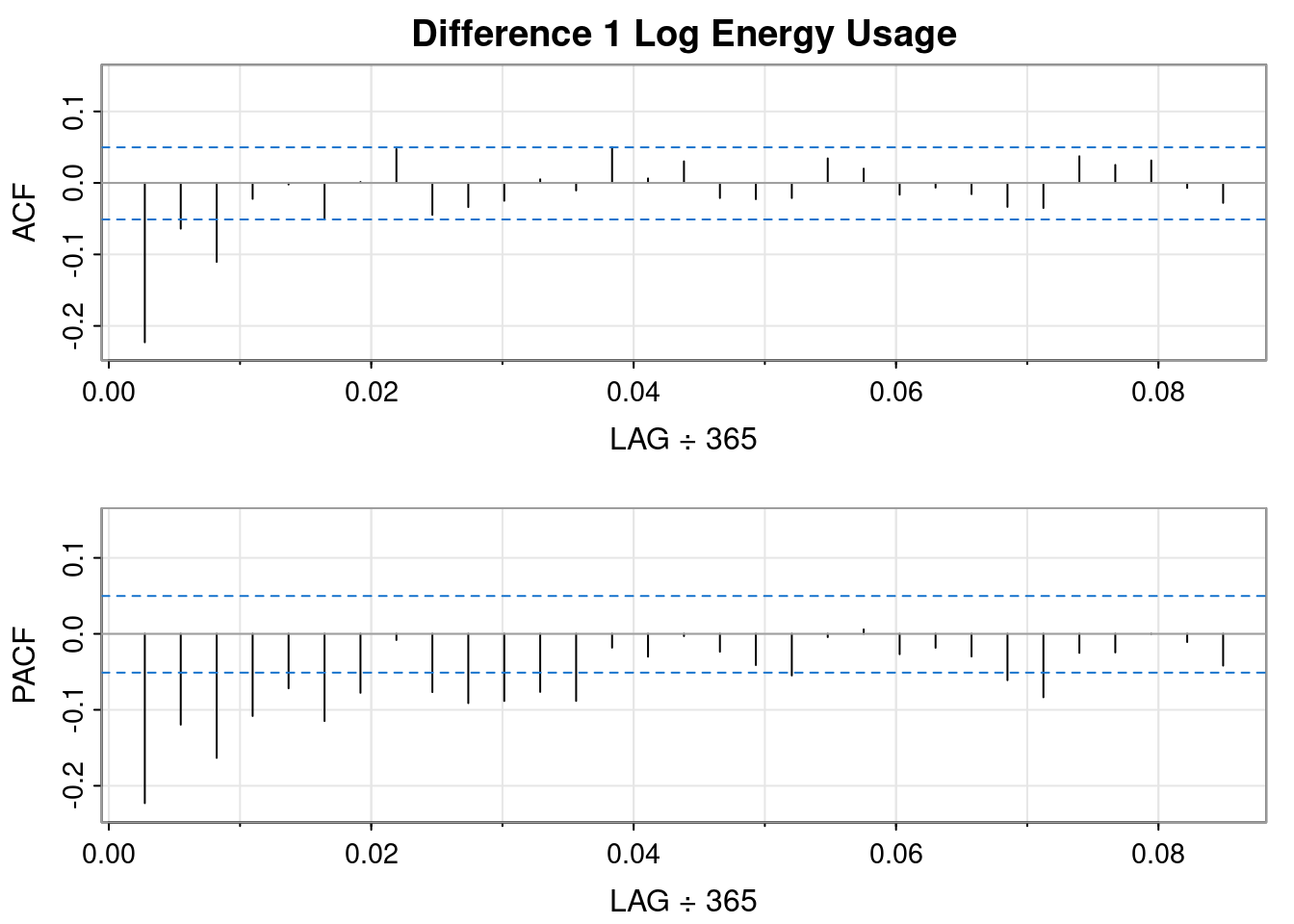
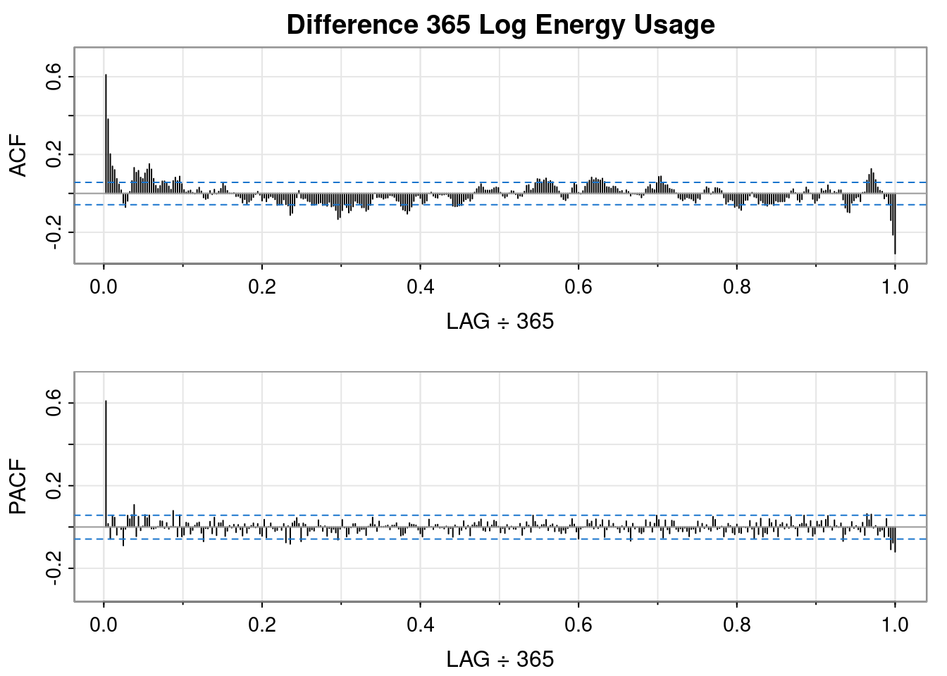
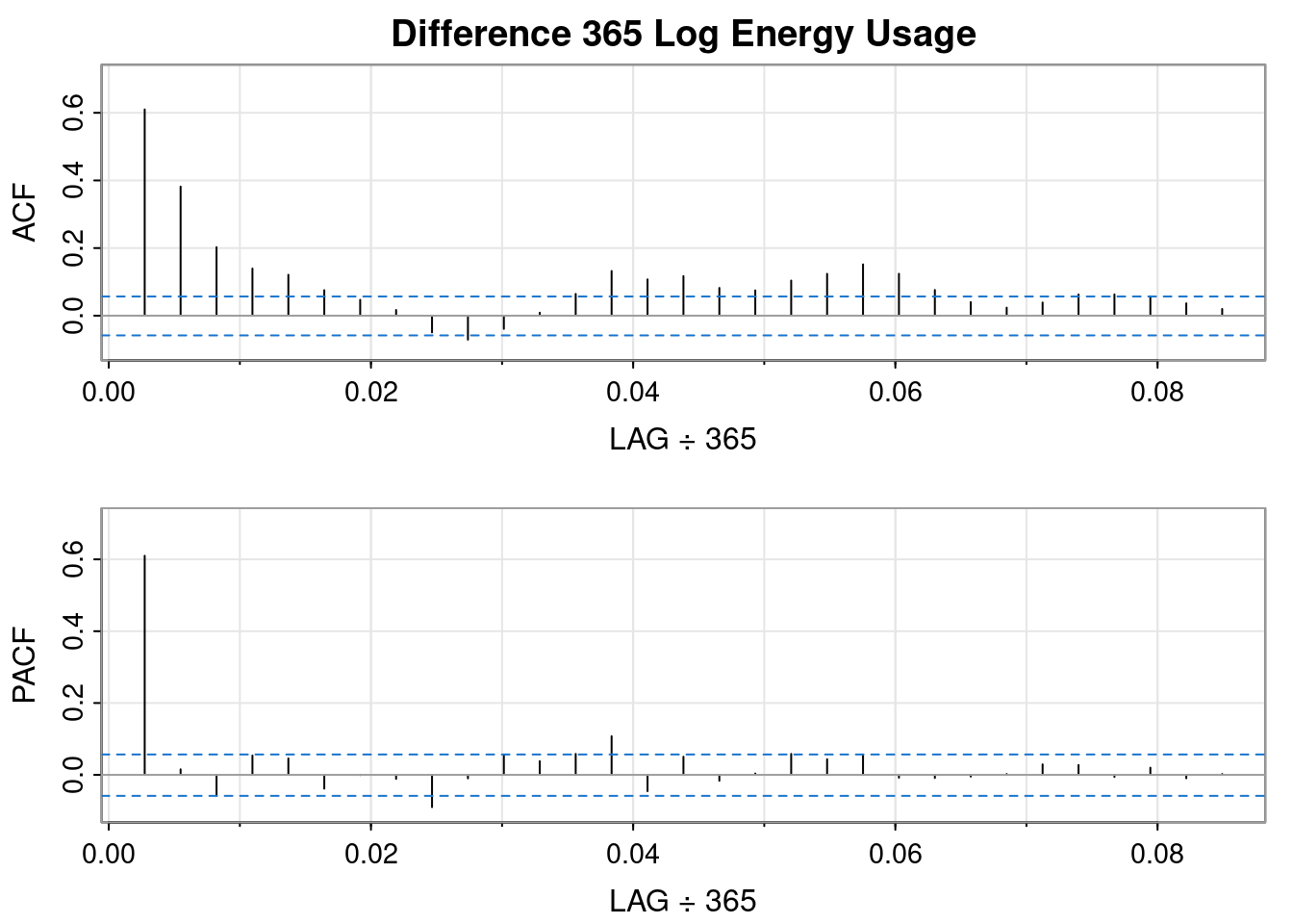
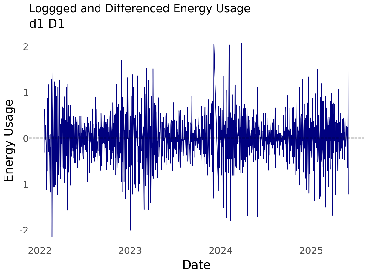
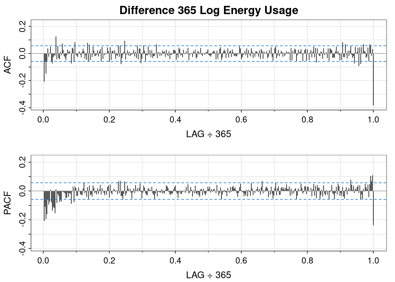
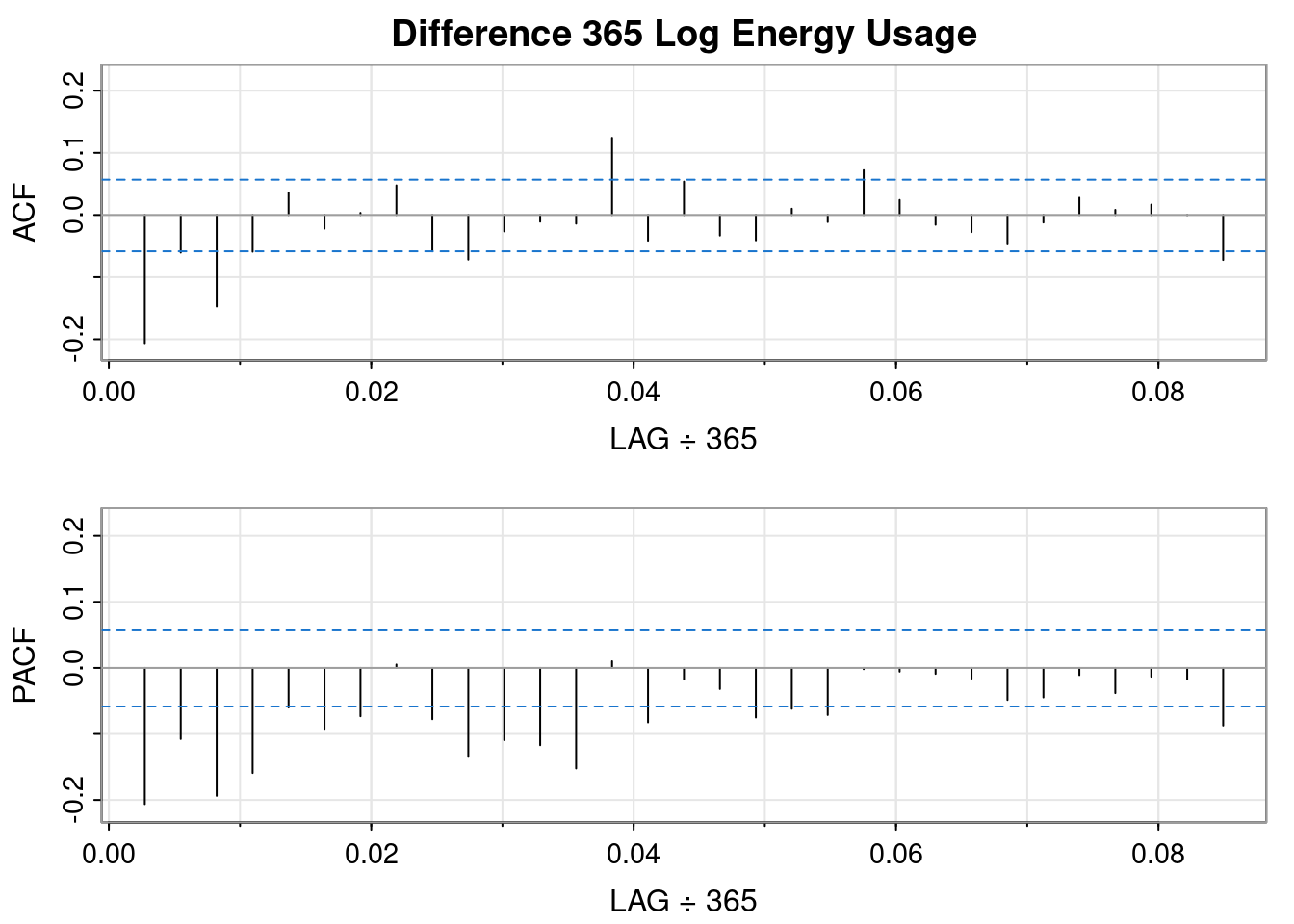
So, differencing the log transformed data resulted in a worse QQ plot and a less obvious interpretation of the ACF and PACF plots, but it sort of looks like an MA(1) might fit.
So, differencing the log transformed data resulted in a worse QQ plot than the logged data but a better QQ plot than the differenced order 1 plot. It sort of looks like an AR(1) fits.
🤔 I don’t think double differencing is the way to go.
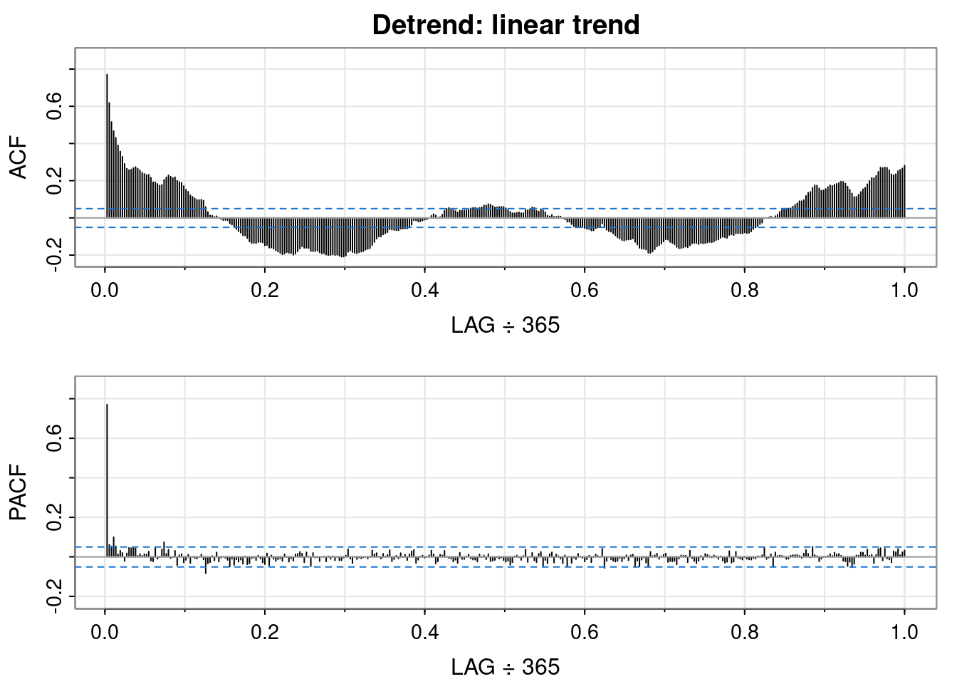
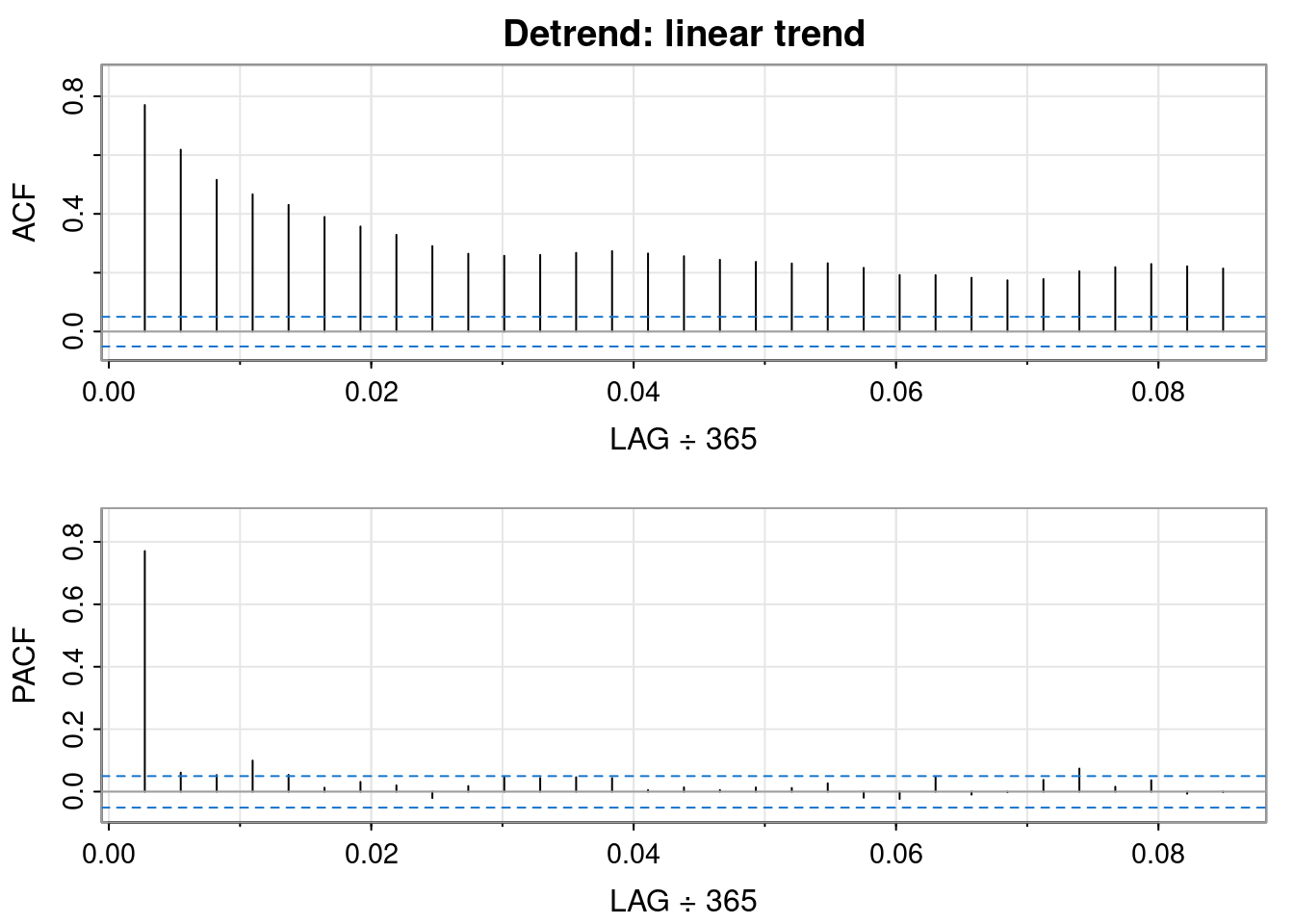
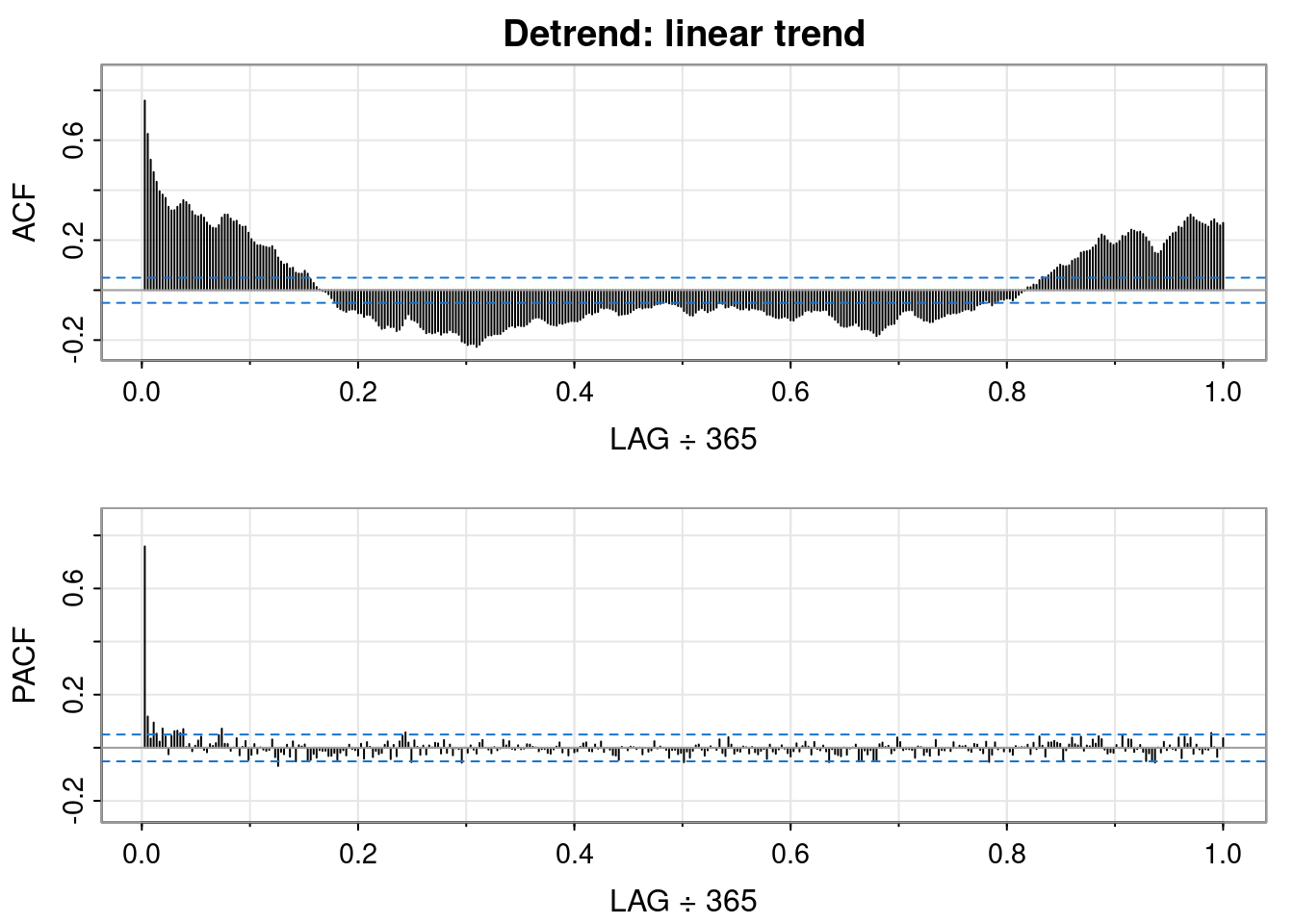
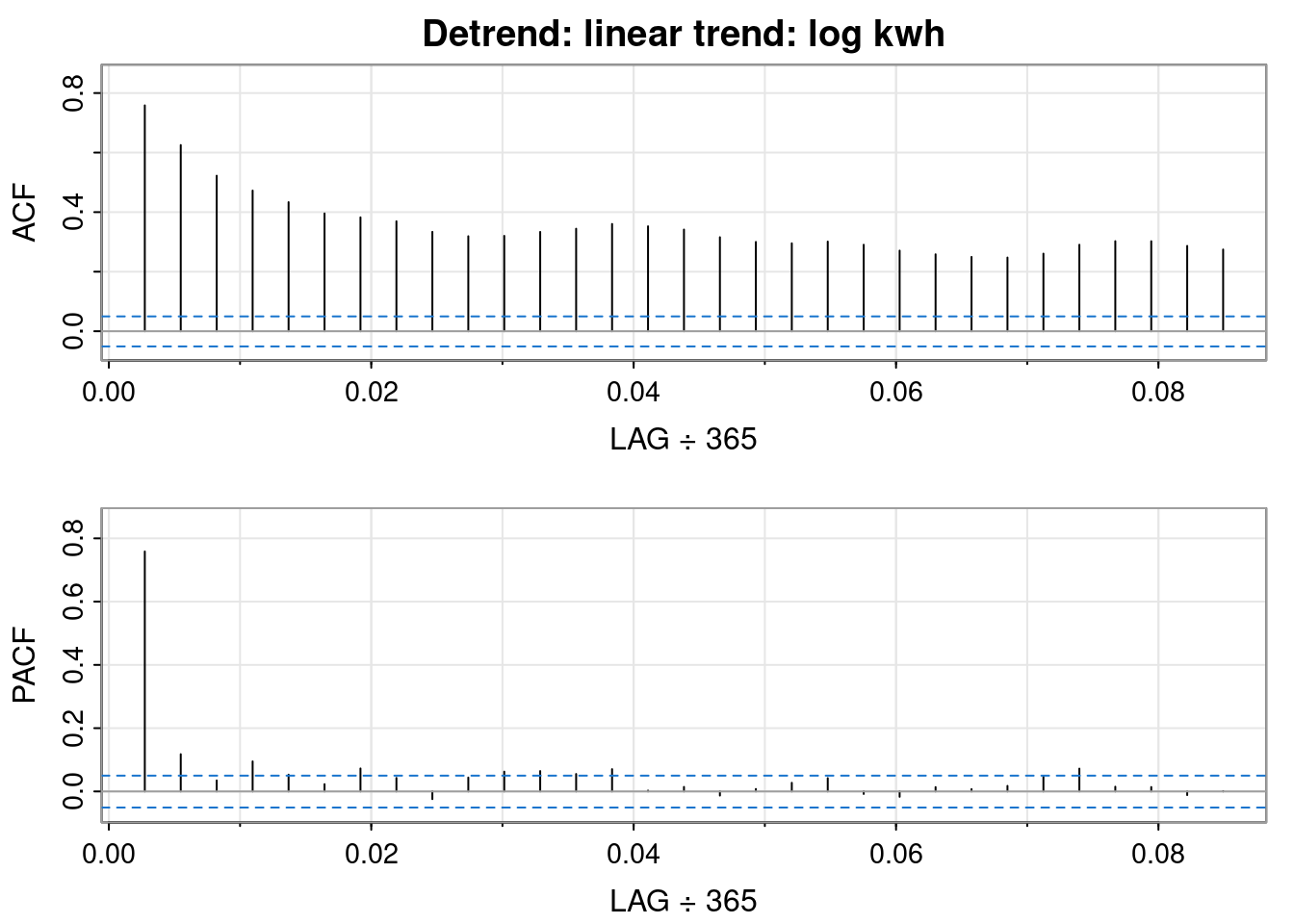
Detrending
Initially, I omitted to assess detrending.
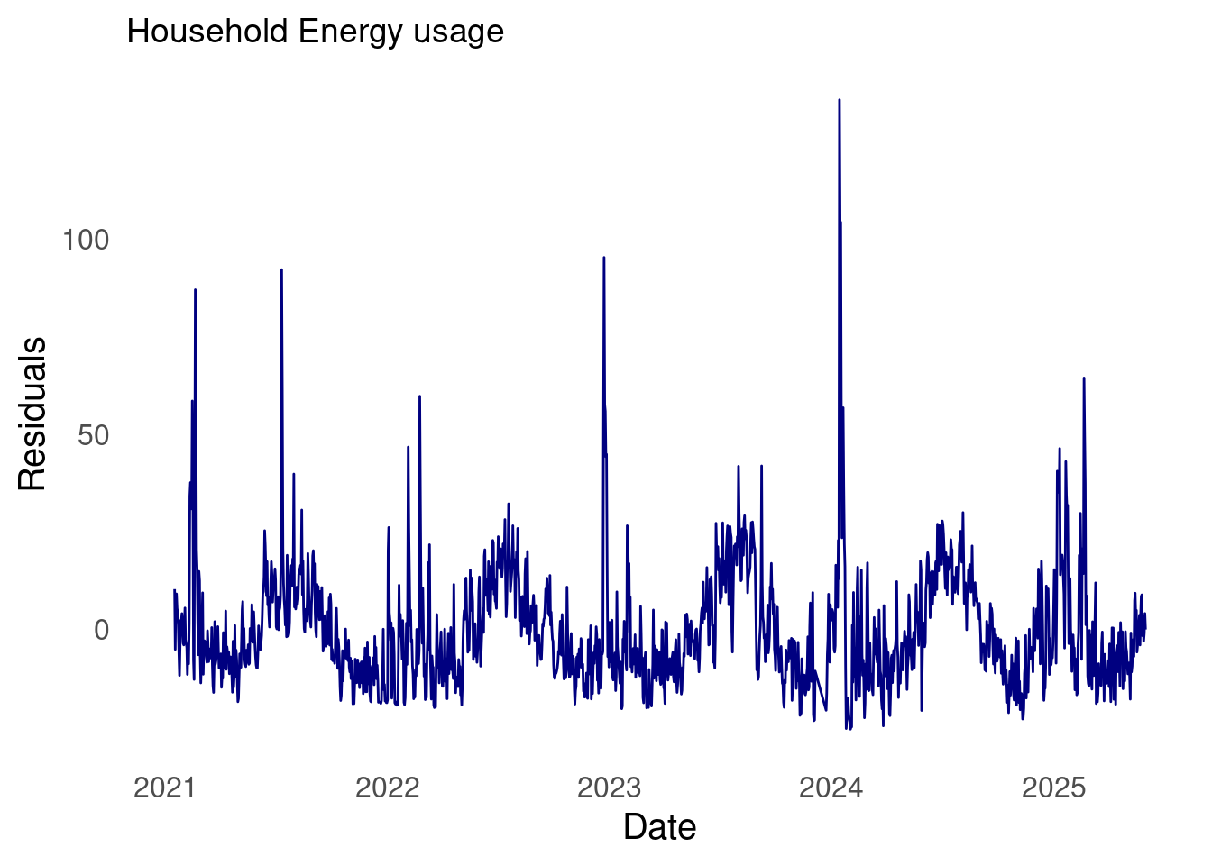
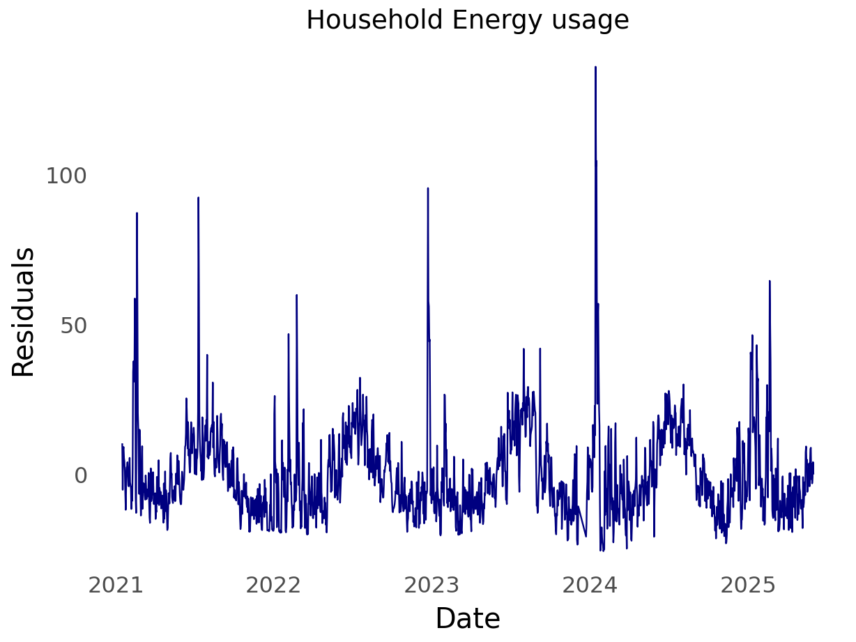
Detrending is the processes of removing the trend from the time series by first fitting a model to the data (i.e, in R lm(y ~ t)) then using the residuals of the model.
As with anything, one could fit numerous models to the data; linear, polynomial, or a time series model such as random walk with drift, etc.
# Ensure date is datetimetmp = r.df_energy.copy()tmp['date'] = pd.to_datetime(tmp['date'])# Drop missing values if anytmp = tmp.dropna(subset=['kwh'])# Sort by datetmp = tmp.sort_values('date')# Create a time index (like `time(ts_data)` in R)tmp['time_index'] =range(len(tmp))# Fit linear modelX = sm.add_constant(tmp['time_index'])y = tmp['kwh']tmpModel = sm.OLS(y, X).fit()
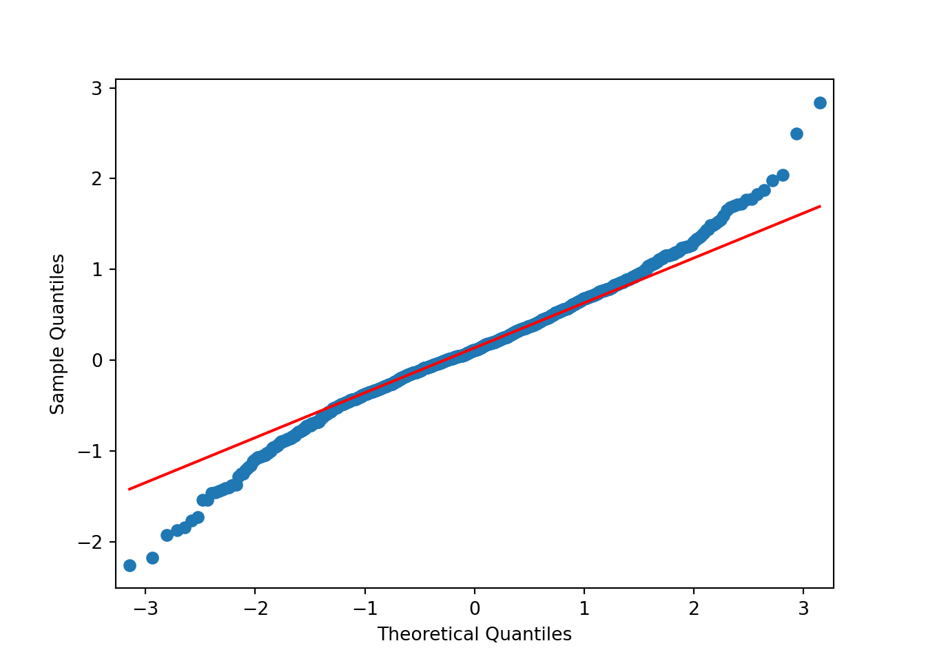
Unlike QQ plots of the differenced data, the residuals of the linear model show fatter tails than the normal on the right, and skinnier tails on the left. Interesting.
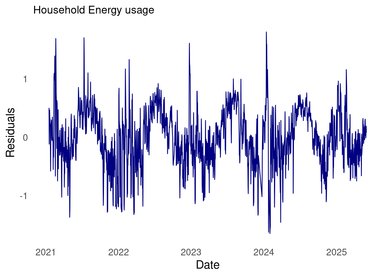
# Ensure date is datetimetmp = r.df_energy.copy()tmp['date'] = pd.to_datetime(tmp['date'])# Drop missing values if anytmp = tmp.dropna(subset=['kwh_log'])# Sort by datetmp = tmp.sort_values('date')# Create a time index (like `time(ts_data)` in R)tmp['time_index'] =range(len(tmp))# Fit linear modelX = sm.add_constant(tmp['time_index'])y = tmp['kwh']tmpModel = sm.OLS(y, X).fit()
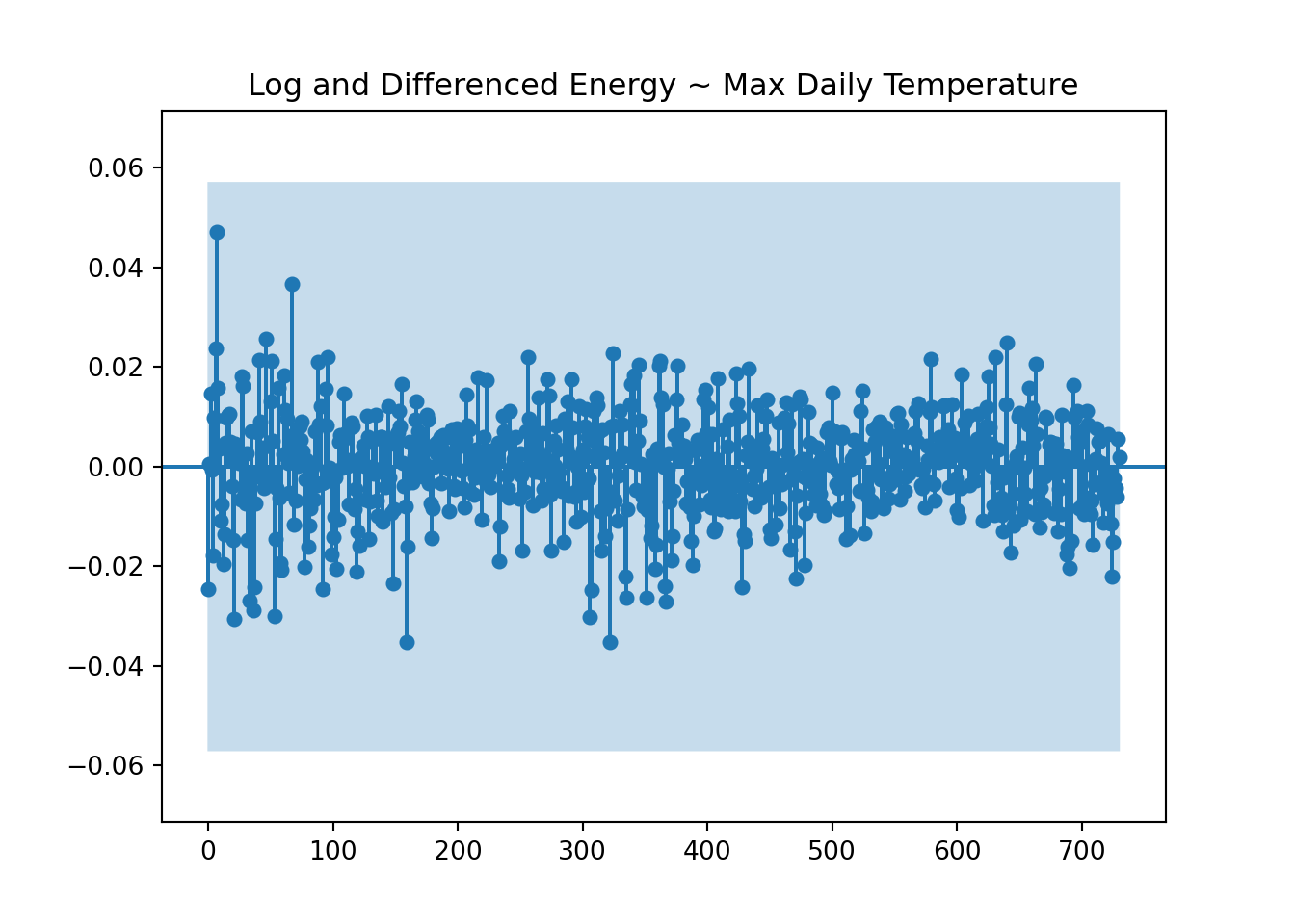
If \(x_t\) and \(y_t\) are independent processes, then under mild conditions, the large sample distribution of \(\hat{\rho}_{xy}(h)\) is normal with mean zero and standard deviation \(\frac{1}{\sqrt{n}}\)if at least one of the processes is independent white noise.
So, in order to effectively use the CCF to analyze the correlation between max temperature and my household energy usage, at least one of the time series must be white noise.
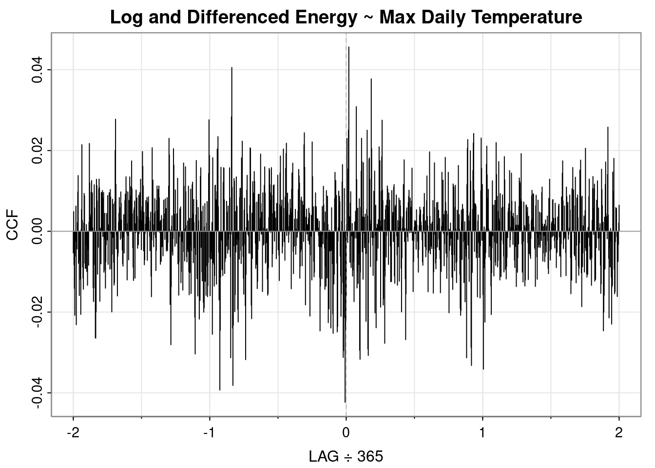
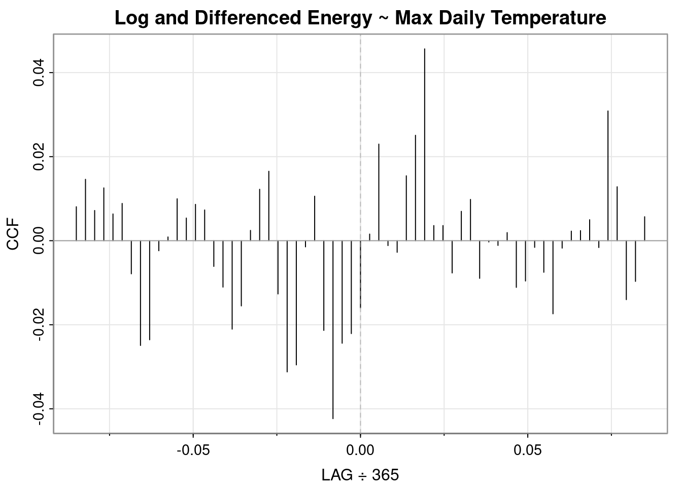
Previously we noted that the log transformation was helpful but the data still appeared to have a slight upward trend and seasonality. Of the differncing options analyzed above, the annual differencing looked most like white noise and the QQ plot was the best of the differenced approaches. So below we’ll assess the cross-correlation between energy usage and max temperature using the log and annual differencing.
plot_ccf( x = tmp['kwh_log'], y = tmp["tmax"], title ="Log and Differenced Energy ~ Max Daily Temperature", auto_ylims =True, lags =365*2, negative_lags=False)
Unhide
ccf2(x =diff(diff(log(ts_data)), 365),y = ts_weather,main ="Log and Differenced Energy ~ Max Daily Temperature",max.lag =365*2)
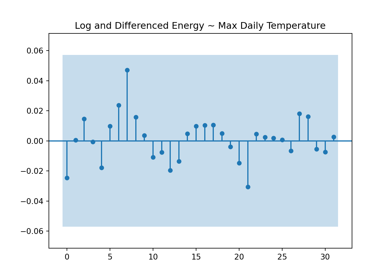
plot_ccf( x = tmp['kwh_log'], y = tmp["tmax"], title ="Log and Differenced Energy ~ Max Daily Temperature", lags =31, auto_ylims =True, negative_lags=False)
Unhide
ccf2(x =diff(diff(log(ts_data)), 365),y = ts_weather,main ="Log and Differenced Energy ~ Max Daily Temperature",max.lag =31)
My household energy usage lags max temperature by 7 days but the correlation is weak.
Appendix
Technical gotchas
Quarto seems capable of using a single engine at a time. Thus, for multilingual projects authors must choose a rendering language. For this project I chose the knitr engine, which renders Python code using the reticulate package. This adds a layer of complexity as running Python through reticulate isn’t the same as running Python code directly. Overall, though the process was quite painless.
Robert H. Shumway, David S. Stoffer. 2019. Time Series, a Data Analysis Approach Using r. 6000 Broken Sound Parkway NW, Ste 300, Boca Raton, FL 33487: CRC Press, Taylor & Francis Group.